Векторная картинка «Груша»
Скачать картинку «Фрукты, Груши» в формате eps одним архивом Яндекс-Народа: grusha.zip
Чтобы скачать png изображение груши с большим разрешением, нажмите на картинку.
Tap to react
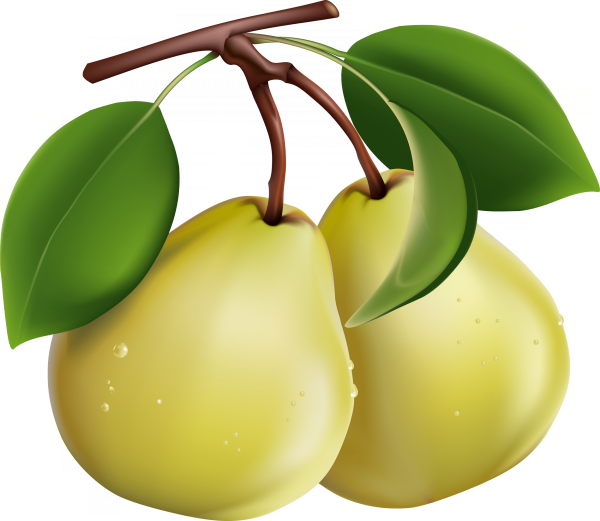
Векторная картинка «Груша» и растровый png большого разрешения с прозрачным фоном
Tap to react