«Москва» — бывший российский футбольный клуб из Москвы. Был основан в 1997 году. В 2001—2009 годах выступал в высшей лиге чемпионата России, был финалистом Кубка России в 2007 году, участвовал в еврокубках. В начале 2010 года снялся с розыгрыша чемпионата. 28 декабря 2010 года прекратил своё существование.
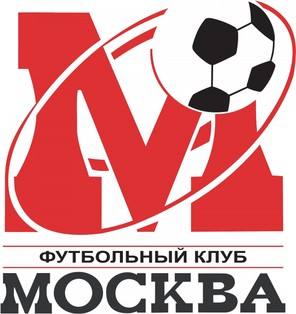
Скачать векторную эмблему футбольного клуба «Москва» в форматах cmx и eps одним архивом: emblema_futbolnogo_kluba_moskva.zip
Лого ФК «Москва» в формате png: 2000 px, 600 px, 300 px.
Tap to react