Предлагаем бесплатно скачать набор фиолетовых веб элементов для сайта, которые предназначены для интерфейса и имеют разрешение 900-700 px при весе архива 2,26 мб.
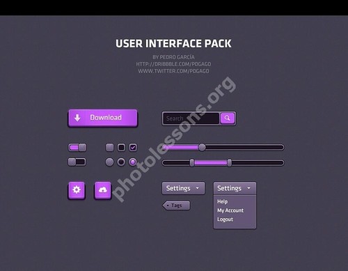
Отличный набор под названием "User interface pack" можно скачать по указанной ссылке внизу статьи.
Tap to react