Wooden GUI - это разрешение снимка 1100-2635 px при 12,71 мб., а также одна из версий набора веб элементов для сайта, выполненная в деревянном стиле.
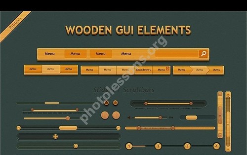
Скачать сет можно по указанной ниже ссылке совершенно бесплатно.
Tap to react

Wooden GUI сет - набор элементов для сайта
Wooden GUI - это разрешение снимка 1100-2635 px при 12,71 мб., а также одна из версий набора веб элементов для сайта, выполненная в деревянном стиле.
Скачать сет можно по указанной ниже ссылке совершенно бесплатно.
Tap to react