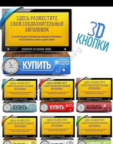
Introduction to 3D Buttons in Web Design

Buttons are the workhorses of web design. They guide users, drive conversions, and make interfaces usable. But a flat button on a crowded page easily gets lost. That is where 3D buttons come in. With depth, shadows, and highlights, a 3D button grabs attention and invites clicks. The set we are looking at today delivers exactly that — a collection of Photoshop 3D button templates with panels, ready to drop into your next project.

Whether you are building a landing page, a dashboard, or an e-commerce store, these buttons add a tactile quality that flat design sometimes lacks. They signal interactivity. Users see the bevel and shadow and instinctively understand: this is clickable. The PSD format makes customization straightforward. You tweak the layer styles, swap colors, adjust the text, and export. No coding required.

This set comes at a resolution of 446 x 436 px per button, with the archive weighing 9.08 MB. That is lightweight enough for quick downloads but detailed enough for high-quality renders.

What Makes These 3D Buttons Stand Out

The design of this button set goes beyond simple gradients and drop shadows. The creator added a range of visual details that make each button feel crafted rather than templated.

Indicators and Badges

Small indicator elements sit alongside the buttons — dots, bars, and badges that draw the eye to specific calls to action. These are useful for highlighting sale items, new features, or limited-time offers.

Wood Textures and Organic Splashes

Unlike sterile flat UI kits, this set incorporates wood textures and splash motifs. This gives the buttons a warm, organic feel that works well for creative portfolios, craft stores, or any brand that wants to feel handcrafted. The textures are layered in PSD groups, so you can toggle them on and off.

Graphic Deadline Elements

A clever addition is the graphic deadline element — a time-related visual that reinforces urgency. This is a countdown-style badge or clock icon placed near the button. It is subtle but effective for conversion-focused layouts. When visitors see a deadline next to a prominently styled button, they subconsciously understand that action is time-sensitive.

Good button design is invisible when done right and impossible to ignore when done well. The deadline element in this set walks that line perfectly.

StyleBest Use CaseVisual Effect
Solid 3D with badgePrimary CTA, checkoutHigh contrast, urgent feel
Wood texture panelCreative portfolios, blogsWarm, organic, handcrafted
Glass-style buttonModern dashboards, appsSleek, translucent, premium
Deadline with timerSales pages, limited offersUrgency-driven, eye-catching
Minimal 3D outlineSecondary actions, navSubtle depth, low visual weight

Working with PSD Templates

PSD files remain the gold standard for Photoshop templates because they preserve layers, effects, and editability. Here is how to get the most out of this set.

Opening and Navigating the File

Once you open the PSD, you will see well-organized layer groups. Each button lives in its own folder with clearly labeled sublayers: background, shadow, text, highlight, and effects. This structure makes it easy to find what you need. If you have worked with layered PSDs before, the layout will feel familiar. If you are a beginner, do not worry — the naming conventions are intuitive.

Changing Colors

To change a button color, locate the shape layer and apply a Color Overlay or adjust the Hue/Saturation. Because the 3D effect relies on multiple stacked layers, you may need to tweak the highlight and shadow layers separately for a consistent look. A good starting point is to adjust only the base color layer and let the layer styles (bevel, inner shadow) blend automatically. Then fine-tune the highlight layer to match the new hue.

Editing Text

Double-click the text layer and type your label. Keep text short — one or two words work best. For longer labels, adjust the padding by moving the button shape layers. Use Ctrl+T to transform and reposition if needed. Remember that 3D buttons have a fixed perspective, so longer text may break the illusion. If your label exceeds two words, consider splitting into a primary and secondary line.

When resizing a 3D button, always use the Free Transform tool with the Shift key held down to maintain proportions. Stretching distorts the bevel and ruins the 3D effect. It is better to recreate the button at the desired size than to stretch a finished one.

Color SchemeMoodBest For
Deep blue + silverTrustworthy, professionalFinance, SaaS, enterprise
Emerald green + goldGrowth, premiumEco brands, luxury goods
Crimson + dark greyUrgency, passionSales pages, entertainment
Amber + creamWarmth, approachableFood blogs, wellness sites
White + light blueClean, minimalTech startups, mobile apps

Best Practices for Call-to-Action Buttons

A beautiful 3D button is wasted if the messaging is weak. Here are principles that work across industries.

Use Action-Oriented Text

Start with a verb. Get, Download, Start, Buy, Try — these words create momentum. Avoid generic labels like Click Here or Submit. A/B tests consistently show that action verbs outperform passive labels. For example, Get Your Free Guide converts better than Download because it sets a clear expectation.

Create Visual Hierarchy

Your primary action should use the most prominent 3D style — solid with badge or high-contrast glass. Secondary actions can use the minimal outline style. The eye should land on the primary button first. In multi-step flows, make sure the primary action button stands out clearly from secondary options like Cancel or Back.

Size Matters

Buttons need to be large enough to tap on mobile but not so large they overwhelm the layout. The 446 x 436 px format works well for hero sections. For inline use, scale down proportionally. A good rule of thumb: the most important action gets the largest button. If all buttons are the same size, the user cannot prioritize.

A well-designed CTA button can improve conversion rates by 30% or more. The combination of 3D depth and clear messaging is a proven formula. Many top-converting landing pages use exactly this approach.

Pair Buttons with Supporting Elements

Place a deadline badge, a check mark, or a short testimonial near the button. Social proof and urgency work together. The deadline elements included in this set are designed for exactly this purpose. A countdown badge next to a 3D button creates a powerful one-two punch that drives action.

\u{201c}

Users do not read. They scan. Your button needs to communicate its purpose in a fraction of a second.

Jakob Nielsen, UX Pioneer

How to Export and Use the Buttons

Once you have customized your button, exporting is simple. You can save individual buttons or entire panels.

Export for Web

Use File > Export > Export As and choose PNG with transparency. For retina displays, export at 2x resolution. The 3D effect benefits from the PNG format because it preserves the transparency around the button edges. SVG is not ideal here because the 3D effects rely on raster layer styles.

Export for Print

If you need the buttons for printed materials, export as TIFF or high-quality JPEG. The wood textures and gradients reproduce well in print. For large-format printing, scale the PSD up to 300 DPI before exporting to avoid pixelation.

Download the Full PSD Set9.08 MB

PSD formatPSD stands for Photoshop Document, the native format of Adobe Photoshop ensures that every layer, effect, and adjustment remains fully editable. That means you can come back to your design weeks later and make changes without starting from scratch.

Why 3D Buttons Still Matter in Modern Design

Some designers argue that flat design has killed the 3D button. But the reality is more nuanced. Flat design works for content-heavy interfaces where simplicity is king. For conversion-focused pages — landing pages, sales funnels, checkout flows — a touch of depth outperforms flat buttons in click-through tests time and again. The key is restraint. Use 3D buttons for primary actions, not for every link on the page. This set gives you the versatility to do exactly that, with styles ranging from subtle to bold.

Neumorphism brought back the debate, but professional designers know that context dictates style. A 3D button on a dashboard signals action. On a blog, the same button might feel too heavy. Match the style to the purpose. That is why having multiple styles in one PSD set is so valuable — you pick what fits without redoing the work.

.btn-3d { background: linear-gradient(180deg, #4a90d9, #2c5f9a); box-shadow: 0 4px 0 #1e3f6a, 0 6px 10px rgba(0,0,0,0.3); border-radius: 4px; color: #fff; font-weight: 700; transition: all 0.1s ease; } .btn-3d:active { transform: translateY(4px); box-shadow: 0 2px 0 #1e3f6a; } [/codeblock]

This CSS snippet recreates the 3D button effect in the browser. The principle is the same as the PSD version — stacked shadows and a subtle press state. You can use it as a reference when translating your PSD designs into live code.

Anatomy of a 3D Button in Photoshop

Understanding how a 3D button is built inside Photoshop helps you customize it more effectively. A typical 3D button consists of five layers stacked in a specific order.

Base Shape Layer

The foundation. A rounded rectangle or custom shape filled with the main color. This layer carries the base gradient and defines the overall dimensions.

Bevel and Emboss

This layer style creates the 3D illusion by adding highlights to the top edge and shadows to the bottom edge. The depth and size parameters control how pronounced the 3D effect looks. For buttons intended for large displays, increase the bevel size.

Inner Shadow

Adds a subtle dark edge inside the button, simulating ambient occlusion. This makes the button feel recessed or raised depending on the angle. Combined with the bevel, it creates a convincing volumetric look.

Drop Shadow

Separates the button from the background. A well-tuned drop shadow uses multiple layers — a tight dark shadow close to the button and a wider softer shadow farther away. This mimics real-world lighting.

Highlight and Reflection

The finishing touch. A semi-transparent white shape at the top edge simulates a light reflection. Some buttons in this set include a subtle glossy streak across the middle for a glass-like finish.

LayerPurposeAdjustment Tip
Base shapeMain color and dimensionsUse rounded corners for a softer look
Bevel & EmbossCreates 3D depthDepth 100-150%, Size 3-7 px
Inner ShadowAdds edge definitionOpacity 30-50%, Distance 1-2 px
Drop ShadowSeparation from backgroundDistance 3-5 px, Spread 10-20%
HighlightSimulates light reflectionWhite, Opacity 40-60%, Soft blend

Photoshop Layer Style: Bevel + Emboss + Inner Shadow + Drop Shadow = 3D Button

Frequently Asked Questions

What Photoshop version do I need to open these PSD files?

These files work with Photoshop CS6 and above, including all Creative Cloud versions. If you use an older version, some layer styles may not render correctly.

Can I use these buttons for commercial projects?

Yes. The set is released under a standard commercial license. You can use the buttons in client work, products, and marketing materials. Redistribution of the raw PSD files is not allowed.

How do I change the font in the button text?

Select the text layer in the Layers panel, then use the Character panel or Type tool to pick any font installed on your system. The layer style (bevel, shadow) will adapt automatically.

What resolution are the buttons designed at?

Each button panel is 446 x 436 pixels at 72 DPI. This is web-optimized, but you can increase the resolution for print by using the Image Size dialog and choosing Preserve Details 2.0.

Do I need to install extra fonts?

The PSD uses standard system fonts for compatibility. If the font is missing, Photoshop will prompt you to substitute it. For the best results, replace with a web-safe font like Open Sans, Roboto, or Lato.

Can I animate these buttons for video or web?

Absolutely. Export each state (normal, hover, active) as a separate PNG and import into After Effects, Premiere, or your web animation tool. The 3D layers are already separated for easy animation.

How do I add my own texture to a button?

Create a new layer above the button base, fill it with your texture, and clip it to the base layer (Ctrl + Alt + G). Set the blend mode to Overlay or Soft Light for a natural look.

What is the best way to change the button shape?

Use the Pen tool or Shape tool to draw a new path, then copy the layer styles from the existing button and paste them onto your new shape. This preserves the 3D effect.

Can I combine multiple button styles in one layout?

Yes. The set includes matching panels so you can mix solid, textured, and outline styles in the same composition. Keep the color palette consistent for a cohesive look.

How do I create a hover state for these buttons?

Duplicate the entire button group, then modify the duplicated version. Brighten the color slightly and increase the drop shadow distance. Save both versions and use CSS or JavaScript to swap them on hover.

Are these buttons suitable for email newsletters?

Yes, with one caveat. Many email clients strip advanced CSS, but using an image-based button (PNG from your PSD) works universally. Just add a plain text fallback link for clients that block images.

Can I extract individual elements like badges and indicators?

Absolutely. Each badge, indicator, and texture is on its own layer. You can hide the button and use only the badge element, or combine elements from different buttons to create custom compositions.

Tap to react