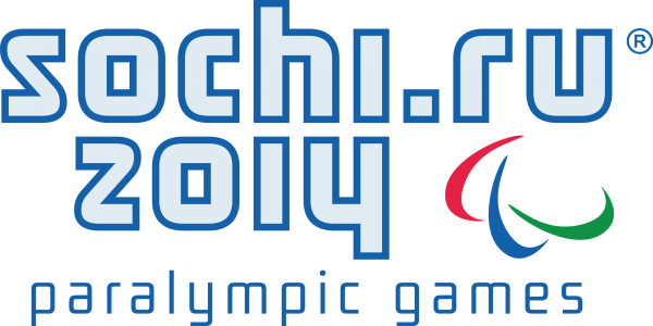
Vector Emblem of the Sochi 2014 Paralympic Games: History, Symbolism, and Free Download in CDR, SVG, EPS, PNG
The emblem of the Sochi 2014 Paralympic Games is one of the most significant sports logos created in Russia in recent decades. The Sochi Paralympic Games were the first in Russia's history and ranked among the world's largest sporting events. If you need a vector file of the Sochi 2014 Paralympic emblem for printing, sports design, educational projects, or archival purposes — you have come to the right place. We have prepared an archive with professional formats: CDR (CorelDRAW), SVG, EPS, plus raster PNG versions at resolutions up to 2500 pixels on the long side.
Here is the emblem itself:
The story behind the Sochi Paralympic emblem
The development of the Sochi Paralympic Games brand began long before the competitions themselves. The Sochi 2014 Organizing Committee announced a competition for the visual identity of the Games in 2010, three years after Sochi was chosen as the Olympic capital. By that time, the Olympic emblem had already been approved — a mirrored reflection of «Sochi» and «2014» with the «.ru» domain — and the Paralympic emblem was to follow the same overall style while carrying its own meaning.
The Paralympic emblem was created by the Interbrand branding agency under the creative direction of Michael Phelps. Interbrand had extensive experience at that point — the agency's portfolio included rebranding of giants such as AT&T, Nissan, and Deutsche Telekom. For the Paralympics, the task was to create an identity that would simultaneously fit into the unified Olympic brand system of Sochi and convey the Paralympic values: courage, equality, inspiration, and determination.
The final version of the emblem was presented to the public alongside the Olympic logo in December 2010. It was built on the same mirror reflection idea, but with a key difference: instead of the «.ru» domain, the Paralympic version uses the paralympic symbol, and the central graphic element became the Paralympic Agitos — three colored crescents symbolizing mind, body, and spirit.
| Date | Event | Significance |
|---|---|---|
| 2007 | Sochi chosen as Olympic capital | Start of Games brand preparation |
| 2010 | Emblem competition | Mirror reflection concept approved |
| 2011 | Brand book published | Detailed emblem usage guidelines |
| 2014 | Sochi Paralympic Games | Massive use of the emblem worldwide |
| 2015+ | Post-Olympic legacy | Use in sports museums, archives, educational materials |
Symbolism of the Sochi 2014 Paralympic emblem
The emblem of the Sochi Paralympic Games is a multi-layered visual statement. Let us examine each element.
The main graphic component is the Paralympic Agitos (from Latin agito, meaning «I move»). Three crescents of red, blue, and green, swirling around a central point, symbolize Paralympic athletes from around the world united by the spirit of competition. This is the official symbol of the International Paralympic Committee, and its inclusion in the Sochi emblem was a mandatory requirement.
The host city name is rendered as a mirror reflection: «Sochi» at the top and its mirror copy below. This visual device symbolizes unity and equality — core values of the Paralympic movement. The mirror reflection also creates the effect of a mountain landscape: the top line represents peaks, the bottom line their reflection in water. This is no coincidence: Sochi is the only city in history where the Winter Games took place simultaneously in a mountain cluster (Krasnaya Polyana) and a coastal cluster (Imeretinskaya Lowland).
The competition year — 2014 — is placed vertically at the junction of the two lines and serves as the axis of symmetry of the entire composition. The emblem's typeface is a sans-serif font specially designed for the Games to ensure maximum readability on any type of medium, from a billboard to a volunteer badge.
The color scheme uses the same colors as the Olympic version: blue (Pantone 286C), red (Pantone 192C), green, and light blue. This creates visual unity across the entire Sochi 2014 brand system and makes it easy to identify which Games the emblem belongs to.
| Element | Symbolic meaning | Practical role |
|---|---|---|
| Agitos | Mind, body, spirit of the Paralympian | Connection to the international Paralympic movement |
| Mirror reflection | Unity, equality, balance | Recognition, visual rhyme with the Olympic emblem |
| Vertical axis 2014 | The year as the event's center | Axis of symmetry of the composition |
| Blue-red palette | Energy, passion, determination | Unity with the Sochi 2014 brand |
| Sans-serif font | Modernity, accessibility | Readability on any medium |
The Sochi Paralympic Games: scale and significance
The XI Paralympic Winter Games took place from March 7 to March 16, 2014. They brought together 547 athletes from 45 countries, who competed for 72 medal sets in five sports: alpine skiing, biathlon, cross-country skiing, sledge hockey, and wheelchair curling.
These Games were historic for Russia. The Russian team won 80 medals, including 30 gold, securing first place in the unofficial team standings. The opening and closing ceremonies were held at Fisht Stadium, drawing an audience of 40,000 spectators in the stands and hundreds of millions on television worldwide.
The main architectural venue of the Paralympics was the coastal cluster in the Imeretinskaya Lowland, where the Iceberg, Shayba, and Bolshoy ice arenas were built. The mountain cluster in Krasnaya Polyana hosted alpine skiing competitions, while the Laura complex hosted cross-country skiing and biathlon.
The Sochi Paralympic Games were a breakthrough for the entire Paralympic movement: for the first time in the history of the Winter Paralympics, the competitions were broadcast live in more than 60 countries, and the total audience exceeded 2 billion viewers. This contributed to an unprecedented surge of interest in adaptive sports and people with disabilities worldwide.
| Metric | Value |
|---|---|
| Dates | March 7–16, 2014 |
| Participating countries | 45 |
| Athletes | 547 |
| Medal sets | 72 |
| Sports | 5 |
| Russian gold medals | 30 |
| Volunteers | 8,000 |
Technical specifications of downloadable files
| Format | Type | Resolution | Background | Usage |
|---|---|---|---|---|
| CDR | Vector | Scalable | Transparent | Editing in CorelDRAW |
| EPS | Vector | Scalable | Transparent | Printing, exchange format |
| SVG | Vector | Scalable | Transparent | Web, mobile apps |
| PNG 2500px | Raster | 2500 pixels on the long side | Transparent | High-quality printing |
| PNG 600px | Raster | 600 pixels on the long side | Transparent | Websites, presentations |
| PNG 300px | Raster | 300 pixels on the long side | Transparent | Social media, email |
All files are packed into a single ZIP archive, logo-paralympic-games-sochi-2014.zip. The archive size is optimized and does not exceed 15 MB, making it convenient for downloading even with a slow internet connection.
Guidelines and recommendations for using the emblem
The use of Olympic and Paralympic symbols is governed by the Olympic Charter and special rules of the International Paralympic Committee (IPC). When working with the Sochi Paralympic emblem, follow these guidelines:
- Do not distort proportions. The emblem's aspect ratio is strictly fixed. When scaling, maintain proportions — do not stretch or compress the image along one axis.
- Maintain clear space. A free area equal to the height of the letter «S» in «Sochi» — approximately 12% of the logo's height — must be maintained around the emblem.
- Do not change colors. The emblem's palette is approved by the IPC and may not be altered. Using a monochrome (black-and-white) version is only acceptable when full-color printing is technically impossible.
- Do not place on busy backgrounds. The emblem's complex color structure requires a contrasting background. The recommended background is white or light gray.
- Provide context. When using the emblem in publications and materials, a reference to the Sochi 2014 Paralympic Games must be present nearby.
Significance of the emblem for the Paralympic movement
The Sochi Paralympic emblem holds a special place in the history of Paralympic branding. Before 2014, the Paralympic Games were often perceived as a supplement to the Olympic Games — and their visual identity was often secondary. The Sochi emblem was one of the first where Paralympic identity was elevated to an equal level with the Olympic one.
The key decision was to use the Paralympic Agitos not as a supporting element but as the central graphic mark. In previous Games (Vancouver 2010, Turin 2006), the Agitos were either absent from the emblem or pushed to the background. Sochi corrected this, which was highly praised by the International Paralympic Committee.
After Sochi, the approach to Paralympic branding changed permanently. At the Games in PyeongChang (2018) and Beijing (2022), Paralympic emblems were already designed as independent marks rather than derivatives of the Olympic ones. It can be said that the Sochi emblem set the standard for an entire generation of Paralympic logos.
Design analysis of the emblem
From a professional standpoint, the Sochi 2014 Paralympic emblem is executed at a high level. Let us examine the key design decisions.
First — symmetry. The mirror composition creates a sense of stability and order, which contrasts with the dynamic Agitos at the center. This contrast between static and dynamic is a deliberate device, emphasizing the dramaturgy of sports competition: intense struggle within clear rules.
Second — typography. The emblem's typeface was designed specifically for the Games and offers enhanced readability. Notice the digit «4»: its open form prevents visual merging with adjacent elements, which is critically important at small scale. The letter spacing is increased by 15% relative to standard, improving perception when reading at a distance.
Third — color contrast. The Agitos use three contrasting colors (red, blue, green) that do not blend even when printed on newsprint. The International Paralympic Committee specifically chose these colors to be distinguishable by people with the most common forms of color blindness — a rarity in sports branding that speaks to the depth of the design's thoughtfulness.
FAQ — Frequently Asked Questions
What does the Sochi 2014 Paralympic emblem symbolize?
The emblem symbolizes the unity and equality of the Paralympic movement. The mirror reflection of the word «Sochi» represents balance and harmony, while the three Agitos represent mind, body, and spirit of the athletes. The vertical axis with the digits 2014 is the center of the composition, and the blue-red color scheme links the emblem to the overall Sochi 2014 brand.
In what formats is the emblem available?
The emblem is available in vector formats CDR (CorelDRAW), EPS (universal exchange format), SVG (for web and mobile apps), as well as raster PNG at resolutions of 2500px (printing), 600px (websites), and 300px (social media). All files are packaged in a ZIP archive.
Can I use Paralympic symbols in commercial projects?
Commercial use requires a license from the International Paralympic Committee (IPC) or authorized organizations. For educational, journalistic, and archival purposes, use is allowed with mandatory source attribution. Unauthorized commercial use of Olympic and Paralympic symbols is prosecuted by law.
How does the Paralympic emblem differ from the Olympic one?
Both use the mirror reflection principle, but the Paralympic version features the Agitos (three colored crescents) as the central element and the word «paralympic» instead of the «.ru» domain. The Olympic version contains the Olympic rings. These are different symbols with different heraldry.
What is the minimum emblem size for printing?
The minimum size for quality printing is 20 mm in width for offset and 30 mm for screen printing. At smaller sizes, the Agitos and thin font lines may lose sharpness. For outdoor advertising, use the vector format — it ensures perfect clarity at any scale.
What software is needed for editing the files?
CDR opens in CorelDRAW (version X5 and above). EPS is compatible with Adobe Illustrator, CorelDRAW, Inkscape, and Affinity Designer. SVG opens in any vector editor and modern browsers. PNG requires no special software — any viewer or image editor will work.
Why were these specific colors chosen for the emblem?
The Agitos colors (red, blue, green) are approved by the International Paralympic Committee as the official colors of the Paralympic movement. The additional light blue in the Sochi emblem links it to the Olympic version. All colors were chosen to be distinguishable by people with the most common forms of color blindness.
How many athletes participated in the Sochi Paralympics?
547 athletes from 45 countries took part in the XI Paralympic Winter Games in Sochi. 72 medal sets were contested across five sports. The Russian team won 80 medals (30 gold, 28 silver, 22 bronze), finishing first in the overall team standings.
Tap to react


