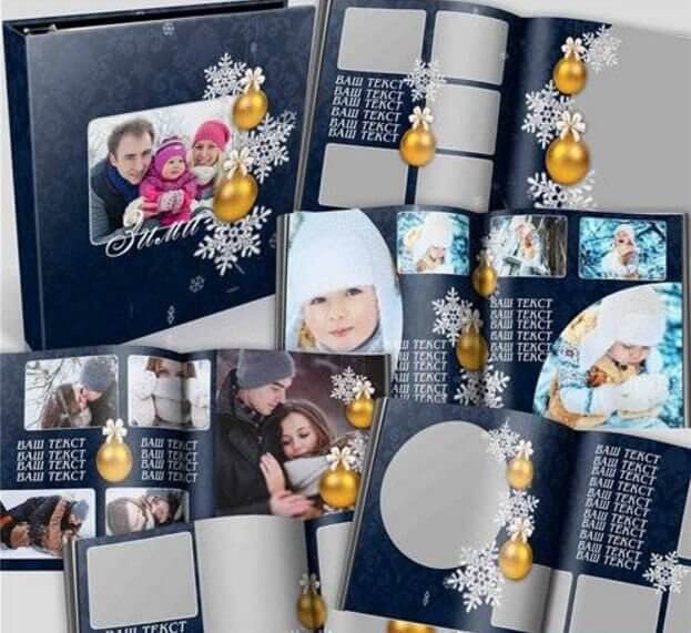
What You Get: PSD Photo Book «Winter Story»
The «Winter Story» photo book template is a full-scale PSD project built for professional holiday photography presentation. Two size options are included — 8197x4134 pixels and 7205x3602 pixels — both at 300 dpi, ensuring crisp output on any print medium from fine art paper to glossy cardstock.
| Parameter | Large Format | Standard Format |
|---|---|---|
| Dimensions | 8197 x 4134 px | 7205 x 3602 px |
| Resolution | 300 dpi | 300 dpi |
| Physical size at 300 dpi | 69.4 x 35.0 cm | 61.0 x 30.5 cm |
| File size | 317 MB (total archive) | |
| Spreads | 1 cover + 7 double-page spreads | |
| Color mode | RGB / 8-bit | |
| Layers | Smart Objects, editable text, adjustment layers | |
The archive weighs 317 MB — not because of bloated assets, but because every layer is preserved at full resolution with non-destructive adjustments intact. No flattening, no rasterized text, no merged smart objects. You open the PSD and everything is editable.
Full layer structure breakdown
- Cover: background gradient, snow overlay, title text layer, photo placeholder (Smart Object), decorative frame elements, bokeh effect adjustment
- Spread 1: winter landscape base, two photo placeholders, text block for story intro, snowflake pattern overlay
- Spread 2: dark wood texture background, three photo slots, decorative divider lines, caption text fields
- Spread 3: gradient sky background, central hero photo, two side photo blocks, title text, date ribbon
- Spread 4: full-bleed photo background, semi-transparent text overlay panel, two accent photo circles
- Spread 5: grid-based layout — 4 equal photo blocks plus center text area, frost border decoration
- Spread 6: panoramic spread — single wide photo with top/bottom text bars, snow particle overlay
- Spread 7: closing spread — large photo, signature text, social media handles, subtle snowflake watermark
Winter Photography: How to Capture Source Images Worthy of Your Photo Book
A photo book is only as good as the images you feed into it. The template can mask small imperfections, but it cannot turn a blurry frame into a masterpiece. Here are the key technical considerations for winter shooting that will deliver print-worthy results at 300 dpi.
Nailing Exposure in Snow: Why Auto Mode Fails
Your camera's light meter is calibrated to 18% middle gray. A snow-covered scene reflects three to four times more light than an average frame — the camera sees white and tries to make it gray, underexposing by 1.5 to 2 stops. The result: gray snow, crushed shadows, lifeless images.
The fix: apply +1.3 to +2.0 EV exposure compensation when shooting snow scenes in aperture priority. Your best guide is the histogram: the right edge should approach but not touch the boundary. A margin of 3-5% on the right is insurance against clipping. Check the histogram for every frame, especially when lighting conditions shift.
White Balance: Cool and Natural, or Overcompensated?
Auto White Balance (AWB) in winter conditions tends to overcompensate: the camera detects cool light and adds warmth, turning crisp blue snow into muddy beige. Here are three approaches to preserve winter atmosphere:
- Manual 5500–6000K — preserves the natural coolness of the scene without going excessively blue. Ideal for sunny days
- Custom white balance off snow — shoot clean, shadow-free snow as a reference target. The camera makes the snow neutral white, while the sky shifts to deep blue. Works well for blue hour and overcast conditions
- AWB plus RAW correction — the compromise option. Include a gray card or white reference in one frame per lighting setup for batch correction in post
Always shoot RAW for non-destructive white balance adjustment. With JPEG, the white balance choice is baked in at capture.
Light, Shadow, and Snow Texture
Snow is not uniform — under low-angle morning or evening light, every snow crystal casts a micro-shadow, creating sparkling texture. Frontal light (sun behind you) kills this texture, turning snow into a flat white sheet. Golden hour (the first and last 60 minutes of sunlight) produces warm backlight that catches snow crystal edges.
For a photo book, scenes with warm-cold contrast are especially valuable: an orange streetlamp or window glow against deep blue snow. Expose for the bright area in such scenes — the background will drop into saturated blue while the light source retains detail.
Editing Workflow: From Blank Slate to Print-Ready Photo Book
Working with a pre-built PSD template is not a shortcut — it is a framework that lets you focus on composition and color rather than structural design. Here is the complete editing sequence I use with this template.
Step 1: Color Space and Profile Setup
Before touching any layer, verify your color settings. Go to Edit → Color Settings. For print-bound projects, switch the working RGB to Adobe RGB (1998) or sRGB IEC61966-2.1 if your print lab explicitly requests sRGB. Do not use ProPhoto RGB here — most commercial print labs will misinterpret the wider gamut, resulting in muted prints.
Step 2: Insert Your Photos via Smart Objects
Each photo placeholder is a Smart Object layer. Double-click the thumbnail to open it in a new window, paste your photo, resize to fit, and save. The smart object updates in the main composition automatically while preserving the original quality of your inserted image.
Why Smart Objects matter for a 300 dpi project:
- Your inserted photo retains its native resolution within the smart object
- Transformations applied to the placeholder layer are non-destructive
- You can replace a photo 50 times without degrading quality
- Filter effects applied to the smart object remain adjustable
\u{201c}When you place a 24-megapixel RAW export into a Smart Object, Photoshop stores the full-resolution embedded file. The 300 dpi output renders every pixel your camera captured — no interpolation, no quality compromise.
Step 3: Winter Color Palette Adjustment
The template ships with a cohesive winter palette, but your photos will have their own color signature. Use Adjustment Layers clipped to your photo smart objects to harmonize the look across spreads.
| Adjustment Layer | Target Effect | Typical Values for Winter Look |
|---|---|---|
| Curves | Lift shadows, cool highlights | Raise black point to 12-18; add slight blue in highlights channel |
| Selective Color | Whites: add cyan; Neutrals: cool down | Whites: Cyan +8, Yellow -4; Neutrals: Cyan +3, Magenta -2 |
| Hue/Saturation | Desaturate competing warm tones | Reds: -15; Yellows: -10; Master: -5 |
| Color Balance | Global cool push | Midtones: Cyan/Blue +8; Shadows: Cyan/Blue +4 |
| Gradient Map | Split-toning for cinematic winter mood | Navy (#1a2a3a) to Ice (#d4e4f4), Blend Mode: Soft Light, Opacity: 15-25% |
Step 4: Text and Typography
All text layers use system-safe fonts with fallbacks. The template defaults to Playfair Display for titles and Open Sans for body text. You can substitute any font — the text blocks are live type layers, not rasterized. Double-click the T icon in the Layers panel to edit directly.
For a cohesive holiday look, consider these font pairings:
- Playfair Display + Montserrat — classic elegance
- Cormorant Garamond + Raleway — editorial magazine feel
- Alice + Roboto Slab — warm, readable, festive
- Neucha + Russo One — rustic, handcrafted (for casual family albums)
Step 5: Snow and Atmosphere Effects
The template includes pre-built snow overlay layers with adjustable opacity and blend modes. For additional atmosphere:
- Duplicate the snow layer and set blend mode to Screen for brighter particles
- Add a Gaussian Blur to a duplicate snow layer at 2-4 px radius — this creates depth-of-field, making foreground snow sharp and background snow soft
- Apply a Levels adjustment clipped to the snow layer: drag the black slider right to thin out the snow, drag white left to intensify it
Print Preparation
Export Settings for Photo Book Services
Different print-on-demand services have different requirements. Here is a reference for the most common platforms:
| Service | Format | Color Profile | Resolution | Bleed |
|---|---|---|---|---|
| Printbook.ru (RU) | JPEG, Quality 12 | sRGB | 300 dpi | 5 mm |
| Saal Digital | JPEG or TIFF | sRGB or Adobe RGB | 300 dpi | 3 mm |
| Mpix / Miller's | JPEG, Quality 10+ | sRGB | 250-300 dpi | 1/8 inch (3.2 mm) |
| Blurb | PDF/X-4 or JPEG | sRGB | 300 dpi | 3 mm |
| Mixbook | JPEG, Quality 10+ | sRGB | 200-300 dpi | Full-bleed supported natively |
| Local print shop | TIFF (LZW compressed) | Adobe RGB or sRGB | 300 dpi | Ask them — usually 3-5 mm |
Sharpening for Print
Screen sharpening and print sharpening are different beasts. What looks crisp on a monitor at 100% zoom will look soft on coated paper. Apply output sharpening as the last step before export:
- Filter → Sharpen → Smart Sharpen
- Amount: 80-120%
- Radius: 0.8-1.2 px (at 300 dpi)
- Reduce Noise: 3-5%
- Remove: Lens Blur
Zoom to 50% (not 100%) to evaluate print sharpness. At 300 dpi, 50% zoom on screen approximates the actual printed sharpness better than 100% view.
Color Management: A Complete Pipeline From Capture to Print
A calibrated monitor is the beginning, not the end, of color management. Your photo book passes through multiple color transformations: RAW development → Photoshop → printer output. Each transition potentially distorts color. Here is how to keep everything under control.
Monitor Calibration: The Mandatory First Step
Without hardware calibration, you are editing blind. What looks warm on your screen may come out cold in print. A hardware calibrator (X-Rite i1Display, Datacolor Spyder) measures your screen's actual output and builds an ICC profile. Recommended calibration targets for print preparation:
- Luminance: 100–120 cd/m² (factory defaults of 160–200 cd/m² give an exaggerated sense of brightness, causing you to darken your images)
- White point: D65 (6500K)
- Gamma: 2.2
Soft Proofing: Previewing the Print on Screen
In Photoshop: View → Proof Setup → Custom. If your print lab provides an ICC profile for their press and your chosen paper, load it. If not, use the built-in U.S. Web Coated (SWOP) v2 profile as a rough approximation of CMYK gamut. Enable «Simulate Paper Color» — it will darken the preview, mimicking how paper absorbs light.
Soft proofing will not show you an exact match (a screen emits light; paper reflects it), but it will reveal colors outside the CMYK gamut. Bright blues and saturated reds are the first candidates for desaturation during conversion.
When to Convert to CMYK (And When Not To)
| Scenario | Action | Rationale |
|---|---|---|
| Print lab requests RGB | Send sRGB or Adobe RGB | The lab converts using their own RIP profile |
| Print lab requests CMYK | Convert using THEIR profile | Request the ICC profile of their press, convert via Edit → Convert to Profile |
| Offset printing house | PDF/X-4 with color conversion | FOGRA51 (coated) or FOGRA52 (uncoated) — standard for European offset |
| Digital press (Indigo, Xerox) | RGB or CMYK as requested | Digital presses handle RGB differently — confirm with the operator |
Print Resolution Demystified: Facts vs. Myths
«300 dpi» is the industry mantra, but the reality is more nuanced. Let us examine when 300 is truly necessary, and when you can get away with less — without visible quality loss.
The Physics of Perception: Why 300 dpi Became Standard
The human eye at reading distance (25–30 cm) can resolve approximately 300 distinct dots per inch. That is the physiological limit for most people — hence the standard. But there are important caveats:
- Paper type: uncoated (matte, offset) paper absorbs ink, reducing effective resolution by 15–25%. On matte paper, 240 dpi and 300 dpi are visually indistinguishable — the dot gain exceeds the grid pitch
- Viewing distance: a wall poster is viewed from 1–2 meters. The effective resolution requirement drops to 100–150 dpi. A photo book spread is viewed from 30–40 cm — here 300 dpi is justified
- Print size: a 24-megapixel file (6000×4000 px) delivers a true 300 dpi on a 50×33 cm print. For A3+ (48×33 cm), resolution drops to approximately 290 dpi — the difference is imperceptible
Minimum Practical Resolution by Output Size
| Print Format | Viewing Distance | Min. Resolution | Optimal Resolution | Paper Type |
|---|---|---|---|---|
| Photo book (20×30 cm) | 30–40 cm | 240 dpi | 300 dpi | Glossy/semi-gloss |
| Photo book (30×40 cm) | 40–50 cm | 200 dpi | 250–300 dpi | Any |
| Photo album (40×60 cm) | 50–70 cm | 150 dpi | 200 dpi | Matte/satin |
| Wall poster (60×90 cm) | 1–2 m | 100 dpi | 150 dpi | Any |
| Large banner (1×2 m+) | 3+ m | 50–72 dpi | 100 dpi | Banner fabric |
\u{201c}I have printed 24-megapixel landscapes on 90×60 cm canvas at 170 dpi — not a single client noticed «insufficient» resolution. Perceived sharpness depends on edge contrast, not pixel-per-inch count. A well-sharpened frame with good micro-contrast at 200 dpi looks sharper than a soft frame at 300 dpi.
Interpolation (Upscaling): When It Works
Suppose you have a 12-megapixel file but need a 40×60 cm spread at 300 dpi. That is approximately 16,500 pixels on the long edge — four times the original. Photoshop's «Preserve Details 2.0» upscaling handles up to 2× enlargement without visible artifacts, provided the source frame has low ISO (100–400).
A useful trick: upscale in steps rather than in one jump — increase by 20% per pass over five to six iterations. The result is subjectively cleaner than a single-step scale. After interpolation, apply Smart Sharpen (Amount 50%, Radius 1.5 px) to restore micro-contrast.
Binding Types: Choosing the Right One for a Winter Photo Book
Your binding choice affects not only durability but also how the spread is perceived. For a winter photo book with panoramic frames, the ability to open flat is critical — otherwise, the center of the spread gets lost in the gutter fold.
| Binding Type | Opens to 180° | Max Pages | Durability | Cost (Relative) | Best For |
|---|---|---|---|---|---|
| Layflat (photo album) | Yes, fully | 30–80 | Very high | High | Panoramic spreads, weddings, landscapes |
| Hardcover (casebound) | No, 130–150° | 50–200 | High | Medium | Thick books, text-heavy projects |
| PUR binding (softcover) | No, 130–150° | 30–120 | Medium | Low | Budget projects, corporate portfolios |
| Wire-O (spiral) | Yes, full 360° | 20–80 | Medium | Low | Working portfolios, catalogs |
| Premium (leather) | Yes, nearly 180° | 20–60 | Extremely high | Very high | Gift and presentation books |
For «Winter Story» with its wide panoramic spreads, I recommend Layflat binding. The spread opens perfectly flat — there is no center fold, and your panorama reads as a single uninterrupted image. The price difference between PUR and Layflat for an 8-spread book is approximately 20–35% — it is worth it if your project includes wide-format frames.
New Year Design Trends for Photo Books
A New Year photo book does not have to be red-and-green kitsch with reindeer. The modern approach to winter design relies on restraint and texture. Here is what works right now.
Dark Mood Palettes
Forget white backgrounds. The dominant trend of recent seasons is a dark base: deep Navy (#0d1b2a), dark emerald (#0b1f1a), anthracite (#1a1a1f). A dark background makes photos visually brighter (contrast against dark surroundings), and metallic accents — gold foil, silver, ice blue — read far more expressively than on white.
Textural Minimalism
Minimal decoration, maximal texture. Backgrounds with micro-textures of paper, linen, wood grain, or frost replace complex illustrative elements. One accent graphic element per spread is sufficient. A large photo plus a textured background looks more premium than a densely decorated page with five frames.
Typography as a Design Element
In 2025–2026, text has shifted from a supporting role to a primary design device. Full-width titles spanning the entire spread, vertical typography, custom ligatures — the typeface functions as a graphic element, not just a word carrier. For winter themes:
- High-contrast serifs (Bodoni, Didot) — create an engraved-on-frosted-glass effect
- Cyrillic-ready alternatives: Cormorant Garamond, Playfair Display, Old Standard TT
- Script fonts (Marck Script, Caveat) — for handwritten-style titles evoking handmade holiday cards
A detailed breakdown of winter font pairings and where to get them follows in the section below.
Winter Typography: Fonts for Holiday Photo Books
A typeface sets the tone for the entire project. For a winter photo book, fonts work on three levels: titles (atmosphere), subtitles (navigation between spreads), and body text (readability). Let us examine the choices for each level.
| Purpose | Font | Where to Get | Character |
|---|---|---|---|
| Title (large / elegant) | Playfair Display | Google Fonts (free) | Elegant, high contrast, festive |
| Title (decorative) | Lobster | Google Fonts (free) | Script cursive, greeting card style |
| Title (bold / modern) | Bebas Neue | Google Fonts (free) | Narrow grotesk, works well as a header |
| Subtitle | Montserrat | Google Fonts (free) | Geometric sans-serif, readable at small sizes |
| Subtitle (alternative) | Raleway | Google Fonts (free) | Elegant sans-serif with thin lines |
| Body text | Open Sans / Roboto Slab | Google Fonts (free) | Maximum readability, Cyrillic support |
| Display (bold contrast) | Russo One | Google Fonts (free) | Brutal display font, contrasts well with light decor |
| Display (handwritten) | Marck Script | Google Fonts (free) | Simulated handwriting, ideal for captions |
Font Hierarchy Rules for Photo Books
- Two to three typefaces per project maximum. Title + subtitle + body. A fourth only for accent use (quotes, captions)
- Contrast without chaos: if your title is Bodoni (serif), your subtitle should be Montserrat (sans-serif). Do not place Playfair Display next to Bodoni — both are high-contrast serifs and will clash
- Print sizing differs from screen sizing: body text below 11 pt at 300 dpi is hard to read. 12–14 pt is the working range for a photo book
- Text color on dark backgrounds: pure white #FFFFFF on Navy looks harsh. Use #E8EDF2 — a slightly bluish off-white that the eye perceives as softer on paper
Creative Variations: Beyond the Default Winter Theme
The template structure is theme-agnostic enough to repurpose. With a few global adjustments, you can shift the mood from winter to autumn, spring, or even a non-seasonal elegant album.
Autumn Conversion Recipe
- Replace the snow overlays with warm bokeh textures (golden/orange tones)
- Swap the cool blue background gradients for amber-to-burgundy blends
- Adjust Selective Color: Whites → add Yellow (+12), Neutrals → add Red (+8)
- Replace snowflake elements with leaf or wood grain patterns
Spring/Summer Conversion Recipe
- Remove snow overlays entirely, add light flare overlays instead
- Shift background gradients to pastel: mint, peach, lavender
- Global Color Balance: Highlights → Yellow +10, Midtones → Green +5
- Increase overall exposure by 0.3-0.5 stops via a Levels adjustment at the top of the layer stack
\u{201c}The best templates are not the ones that look perfect out of the box — they are the ones that give you a solid structure to build on. «Winter Story» delivers exactly that: a framework that respects your creative decisions while handling the heavy lifting of proportion, spacing, and visual rhythm.
Frequently Asked Questions
Can I use this template with Photoshop Elements?
Yes, with limitations. Photoshop Elements supports PSD files and Smart Objects, but some adjustment layers (Selective Color, Gradient Map with complex blend modes) may not render identically. Elements also lacks the Color Balance tool — you would need to approximate it with Color Variations. The template will open and work, but the full color grading workflow requires full Photoshop CC.
What version of Photoshop is required?
The template is saved in a format compatible with Photoshop CS6 and newer (including all Creative Cloud versions). Smart Objects, adjustment layers, and text layers are all CS6-compatible features. If you are running CS5, the file will open but Smart Object functionality may be limited.
How do I change the photos without breaking the layout?
Every photo placeholder is a Smart Object. Double-click its thumbnail in the Layers panel, a new document opens — paste your photo, resize to fill the canvas, Ctrl+S to save, close the window. The main composition updates automatically. Your original photo stays at full resolution, and the placeholder mask preserves the layout boundaries.
Can I add more spreads?
Yes. The spreads are organized as Layer Groups. To add a spread, duplicate an existing Group, clear its photo Smart Objects, and add new content. Be mindful of file size — each additional full-resolution spread adds approximately 35-40 MB to the working PSD. For a 20-page book, you will need ample RAM (32 GB recommended).
The snow effect looks too dense — how do I reduce it?
Select the snow overlay layer, add a Levels adjustment clipped to it (Alt+Click between layers). Drag the black output slider to the right — this removes the faintest particles. Drag midtones to reduce overall density. Alternatively, simply lower the layer opacity to 40-60%.
Is the template compatible with Affinity Photo?
Affinity Photo opens PSD files but does not support Smart Objects in the same way. Photo placeholders will appear as regular pixel layers. You would need to manually place and mask photos, which is workable but less convenient. Adjustment layers generally convert correctly, though Gradient Maps may need recalibration.
What paper type do you recommend for printing a winter-themed photo book?
For winter imagery with snow and bright highlights, semi-gloss or lustre paper works best — it preserves highlight detail without the glare of full gloss. Matte paper absorbs ink differently and can make snow look gray rather than white. If you want a premium feel, Fuji Pearl or metallic paper makes snow textures sparkle under directional light.
How do I prepare the file for a print lab that requires PDF/X?
First, flatten a copy of your final composition. Then go to File → Save As → Photoshop PDF. In the PDF dialog, choose PDF/X-4:2010 preset, enable «Preserve Photoshop Editing Capabilities» (for your own archive copy), set Compression to JPEG Maximum Quality, and disable downsampling — you are already at 300 dpi.
Can I sell photo books I create with this template?
Yes, you may use the template to create finished photo books for your clients. The template itself cannot be resold, redistributed, or included in other template bundles. The license covers unlimited commercial use of the final output — the printed book, the exported JPEGs, the PDF for print — but not the editable PSD as a standalone product for resale.
What if my photos have different aspect ratios?
Smart Object placeholders are masked to specific aspect ratios. If your photo does not match, double-click the Smart Object, use Ctrl+T to transform, hold Shift for proportional scaling, and position the photo so the important content falls within the visible mask area. The mask will crop the edges automatically — that is its job. No need to pre-crop your photos before insertion.
Can you handle the printing for me?
No, we do not provide printing services. We supply the PSD template, which you can send to any photo lab of your choice — Printbook.ru, Saal Digital, Blurb, Mpix, Mixbook, or a local print shop. All listed services accept either PSD files or exported JPEG/TIFF files.
What should I do if fonts are missing when I open the PSD?
Photoshop will display a missing font warning on open. You can replace the missing fonts with any installed on your system using the font substitution dialog. All fonts used in the template (Playfair Display, Open Sans, Montserrat) are free and available on Google Fonts. Download and install them before starting work for a perfect match to the intended design.
Tap to react