Zigzag Font for Photoshop: Free Download and Installation Guide
If you remember the DuckTales cartoon character Gyro Gearloose (Zigzag McKryak in Russian), this font shares his name — and his quirky, inventive personality. Nothing to quack about: the Zigzag font is free to download and use. It brings bold, angular energy to any design project.

This font is for people with imagination — it's truly original in its execution. Latin characters only — no Cyrillic support. If your project requires Russian text, you'll need an alternative or use Zigzag specifically for English-language elements like slogans, numbers, or brand names.
What Is the Zigzag Font
Zigzag is a decorative font with signature zigzag-shaped elements. Every letter looks like it was drawn with a broken line — hence the name. The design is simultaneously playful and professional: it works equally well on a rock concert poster or a children's birthday invitation.
The font belongs to the display font category, meaning it's designed primarily for large text: headlines, logos, signage, posters. It's not suitable for body text — readability drops dramatically at small point sizes.
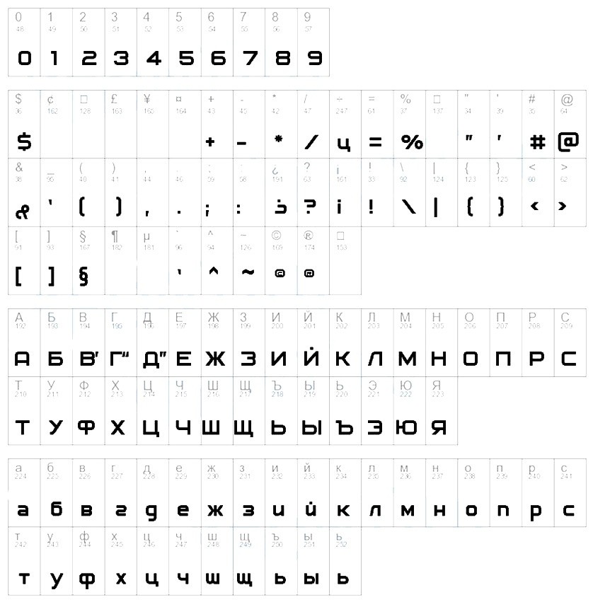
The Zigzag font contains only Latin characters (A-Z, a-z), numerals (0-9), and basic punctuation. No Cyrillic. If you need a Cyrillic zigzag-style font, look for generated alternatives based on this style.
How to Install the Zigzag Font on Windows
Installing a font on Windows is a three-click process. Here's the step-by-step:
- Download the Zigzag font archive and extract it to any folder. You'll find a file with a .ttf or .otf extension inside.
- Right-click the font file and select "Install".
- If a User Account Control (UAC) prompt appears, click "Yes".
- Done. The font is installed and immediately available in Photoshop and other programs.
Alternative method — installing via the system Fonts folder:
- Press Win + R, type
fonts, and hit Enter. - Drag the font file into the Fonts window that opens.
- The system installs the font automatically.
After installation, restart Photoshop if it was open. The program scans system fonts only at startup.
Don't delete the original font file immediately after installation. Keep a copy in a safe place in case you need to reinstall your system. Font source files are easily lost, and finding the exact version again can be tricky.
How to Install the Zigzag Font on macOS
On Mac, the process is even simpler:
- Download and extract the archive.
- Double-click the font file (.ttf or .otf extension).
- The Font Book application opens with a preview.
- Click the "Install Font" button.
- Done. The font appears in Photoshop immediately after restarting the editor.
You can also drag the font file directly into ~/Library/Fonts/ — this installs the font for your user only. To make it available for all accounts on the computer, drag it into /Library/Fonts/.
To verify installation, open any text editor, type a few letters, and select Zigzag from the font dropdown. If it's there — everything works.
Alternative Method: Portable Installation Without Admin Rights
If you don't have administrator rights (e.g., a work PC), you can install the font in your local user folder. On Windows:
- Create folder
C:\Users\YourName\AppData\Local\Microsoft\Windows\Fonts\if it doesn't exist. - Copy the font file into this folder.
- Open Photoshop, press Ctrl + T (Type tool), and check if the font appears.
This method doesn't work on all Windows versions, but in most cases the font is picked up without issues.
Where to Use the Zigzag Font
Decorative fonts are a specific tool. Wrong usage kills a design; right usage makes it memorable. Let's explore the best use cases for Zigzag.
Headlines and Titles
A large zigzag headline instantly grabs attention. Use Zigzag for:
- Magazine and website article titles;
- Book and album covers;
- Presentation titles (where an informal style fits);
- Advertising banners with short slogans.
The golden rule: keep the headline short. Two to four words maximum. Long texts in this font are unreadable — the eye simply refuses to process them.
\u{201c}
Zigzag is an accent font. One word in it works as a visual magnet. Ten words — as a line-porridge.
Logos and Branding
Zigzag works perfectly for logos — provided your brand is associated with energy, movement, youth, or creativity. Good examples:
- Band logo (rock, indie, electronic);
- Streetwear or skate culture brand;
- Children's entertainment center;
- App or game with pixel/retro aesthetics.
For law firms, medical practices, or financial companies, Zigzag is contraindicated. Decorative fonts undermine trust in conservative industries.
Posters
The zigzag font works great on posters — especially music, tech, or urban culture themes. A single word in Zigzag on a poster reads from 30-50 feet away.
Table: Font Styles and Where to Use Them
| Font Type | Examples | Best For | Avoid Using For |
|---|---|---|---|
| Zigzag-style (Zigzag) | Zigzag, Zig Zag | Logos, posters, headlines, album covers | Body text, business letters, reports |
| Grunge/Torn | Dirty Grunge, Broken | Rock posters, horror themes, street art | Children's projects, healthcare, education |
| Handwritten | Lobster, Pacifico | Invitations, greeting cards, food blogs | Serious news, technical documentation |
| Pixel | Press Start 2P | Game graphics, retro projects, geek themes | Corporate presentations, resumes |
| Geometric | Futura, Montserrat | Modern minimalism, architecture, fashion | Children's books, fairy-tale themes |
| Serif | Times New Roman, Georgia | Books, newspapers, academic articles | Mobile app interfaces |
| Sans-serif | Helvetica, Roboto | Web interfaces, navigation, menus | Poetry collections, classic literature |
Font Combinations: What Pairs Well with Zigzag
One of the biggest beginner designer mistakes is pairing a decorative font with another decorative one. This creates visual noise that buries the message. The rule is simple: decorative font + neutral font.
| Zigzag (heading) | Pairing Font (body) | Style | Best For |
|---|---|---|---|
| Zigzag Bold | Montserrat Regular | Modern, clean | Portfolio sites, landing pages |
| Zigzag | Open Sans Light | Light, airy | Blogs, articles, online magazines |
| Zigzag | Roboto Slab | Contrasting, confident | Presentations, brochures |
| Zigzag | Lato Regular | Friendly, approachable | Social media, infographics |
| Zigzag | Playfair Display | Elegant, high-contrast | Book covers, restaurant menus |
| Zigzag | Courier New | Retro, typewriter | 80s-90s style posters |
Experiment with sizes. Zigzag at large point sizes (48pt+) paired with a thin font at 14-16pt creates the classic "accent-foundation" contrast that works 90% of the time.
Typography Basics: Why Zigzag Stands Out
To understand why Zigzag looks the way it does and where to use it, let's cover a few typography principles.
Contrast and Readability
Fonts divide into text fonts and display fonts. Text fonts are designed for reading long passages — they have balanced proportions, uniform rhythm, predictable letter shapes. Display fonts are designed to attract attention. Zigzag belongs to the second category, which dictates all usage recommendations.
Emotional Perception
Zigzag shapes subconsciously evoke energy, dynamics, chaos. Unlike rounded fonts perceived as friendly and soft, Zigzag transmits tension and movement. Use this property consciously.
Text Hierarchy
Every layout needs hierarchy: main heading, subheading, body text. Zigzag excels at the top level. At level two, use a simpler font; at level three, something maximally readable. Never use Zigzag across all three levels.
Zigzag vs Similar Decorative Fonts
If you like Zigzag but want comparisons, here's a selection of stylistically similar fonts:
| Font | Style | License | Cyrillic | Best For |
|---|---|---|---|---|
| Zigzag | Zigzag, broken lines | Free | No | Posters, logos, covers |
| Zig Zag (alt) | Zigzag, more geometric | Free | No | Technical headlines |
| Broken | Torn, destroyed | Free for personal | No | Horror posters, metal flyers |
| Lightning | Bolts, sharp angles | Free | No | Superhero themes |
| Stencil Zigzag | Stencil zigzag | Free | No | Military design, crates |
| Jagged | Saw-tooth, sharp | Free for personal | Yes | Extreme sports |
As you can see, Zigzag has very few direct analogues with Cyrillic support. It's an English-language tool, so plan accordingly. If your project needs Russian letters, use Zigzag only for individual English inserts or numbers.
Font Licensing: What You Need to Know
Before using any font in commercial projects, check the license. Zigzag is free, but even free fonts come in different types:
- SIL Open Font License (OFL) — usable in any project, including commercial. Can be modified. Cannot sell the font itself.
- Free for personal use — personal projects only. Commercial use requires a license.
- Demo / Trial — limited character set preview version. Full version is paid.
- Public Domain — do anything, no restrictions.
Before using Zigzag in a commercial project (logo for sale, client branding, advertising), verify license terms in the readme.txt file inside the archive or on the download site.
Practical Tips for Using Zigzag in Photoshop
Anti-Aliasing Settings
Open the Character panel (Window — Character) and check the anti-aliasing dropdown. For Zigzag, Sharp works best — it preserves the angular letter shapes without blurring. Smooth can round off the sharp corners and kill the font's character entirely.
Letter Spacing (Tracking)
For short words like logos, set tracking to 50-100 units. Zigzag letters merge at default spacing, and the broken lines start intersecting. A slight spread makes each letter legible independently and enhances the angular effect.
Color Choices
Zigzag looks great in:
- Black on white — classic, universal;
- Neon colors (cyan, magenta, lime) on dark backgrounds — 80s retro aesthetic;
- Metallic gradients — for logos and premium designs;
- High-contrast pairs (yellow on purple) — for maximum attention capture.
The History of Display and Decorative Fonts
Decorative fonts aren't a 20th-century invention. Their lineage stretches back to the era of manual typesetting and further — to medieval manuscripts with ornamental initials and craftsmen's shop signs where every letter was carved from wood by hand.
The first display fonts as a distinct category emerged in the 19th century alongside the Industrial Revolution. Advertisers needed bold headlines readable from thirty feet away. Type foundries responded with ultra-bold grotesques, slab-serif Egyptians, and purely decorative typefaces. By the 1820s, catalogs bristled with dozens of display styles: extra-bold, inline, three-dimensional, shadowed. Vincent Figgins released the first commercial slab-serif Egyptian typeface in 1815 — the starting point for the entire decorative typography industry.
The 20th century brought waves of innovation. The 1960s exploded with psychedelic typefaces — melting, floating, and warping letters inspired by hippie culture and concert posters. The 1970s-80s gave us disco neon fonts and the aggressive geometry of new wave design. The 1990s brought grunge: torn edges, dirty textures, deliberate sloppiness inspired by David Carson and Ray Gun magazine. The 2000s saw a digital font explosion: any designer could create a typeface and upload it to DaFont, FontSpace, or Google Fonts. This is when fonts like Zigzag emerged — niche, authorial, free, born from enthusiasm rather than corporate commissions.
Today, decorative fonts are a full-fledged visual communication tool, not mere decoration. Zigzag sits within this lineage: it fuses 1980s energy with 21st-century accessibility, giving every designer access to an expressive instrument without a licensing budget.
Fine-Tuning: Kerning, Leading, and X-Height for Display Fonts
When working with a display font like Zigzag, default text settings won't cut it. Three parameters demand manual attention in every layout.
Kerning — Spacing Between Letter Pairs
Kerning adjusts the gap between specific character pairs. Decorative fonts often have incomplete kerning tables — the type designer may not have defined spacing for every combination. Check pairs like AV, WA, LT, To, Ye — in Zigzag these tend to either collide or drift apart, creating visual gaps. Fix them manually through the Character panel in Photoshop: select the space between two letters and set a kerning value, typically -20 to +40 units.
Leading — Line Spacing
Display fonts need significantly more leading than text fonts. Where standard text fonts read comfortably at 120-130% leading, Zigzag demands at least 140-160%. The broken-line letterforms create a dense, aggressive visual rhythm, and lines need extra breathing room. At 120% leading, Zigzag lines crash into each other — angular strokes from the line above collide with ascenders from the line below. Add space, and every line breathes independently.
X-Height — The Body of Lowercase Letters
X-height defines how much space the core of a lowercase letter occupies, excluding ascenders and descenders. Zigzag has a slightly elevated x-height relative to standard proportions — lowercase letters appear larger than expected for their point size. This is excellent for headlines: text looks more monumental and fills more layout space. But below 24pt, lowercase Zigzag letters merge into an illegible mass — contours break apart, details vanish. Keep Zigzag large: 36pt and above is its native environment.
Detailed Font Pairings: Zigzag in Action
Font pairing theory is useful, but let's look at concrete examples of how Zigzag behaves alongside different typefaces. Each combination creates a unique mood and suits specific project types.
Zigzag + Open Sans
The classic combination: an energetic, angular headline paired with the most neutral text font. Open Sans — one of the world's most readable fonts, designed by Steve Matteson for Google — is so familiar to the eye it becomes invisible. Readers perceive only the content, not the font. Against this calm backdrop, Zigzag hits like a visual explosion. Perfect for landing pages, articles, and blogs where the headline must grab attention and body text must stay out of the way.
Zigzag + Roboto
A more technological, contemporary pairing. Roboto — Android's system font — has mechanical, slightly geometric forms. Unlike Open Sans, Roboto doesn't try to disappear entirely; it asserts itself with restraint, through precision of line and uniform rhythm. Zigzag against Roboto creates a contrast of organic chaos versus engineering precision — like graffiti on a glass skyscraper facade. Excellent for tech blogs, startup presentations, product documentation, and IT company websites.
Zigzag + Lora
An unexpected and striking pair. Lora is a serif typeface inspired by calligraphy, with expressive curves and smooth stroke-weight transitions. The contrast between angular, sharp Zigzag and soft, feminine Lora generates powerful dramatic tension. This combination works in editorial layouts, book covers, restaurant menus, and branding that needs to bridge boldness with elegance. The rule: Zigzag for headlines at 60pt and above, Lora for body text at 14-16pt, and nothing in between.
Zigzag + Bebas Neue
Two display fonts in one layout — a move for confident designers. Bebas Neue is narrow, tall, and exclusively uppercase. Paired with Zigzag, it creates a dual-accent effect: one screams with jagged angles, the second with height and monumentality. The combination thrives on posters, album covers, and brutalist web design where visual saturation is deliberate style, not a mistake. The key: assign distinct roles — Zigzag for the hero word, Bebas Neue for supporting information.
Design Project Ideas with Zigzag
Where does Zigzag truly shine? Here are five concrete ideas for your portfolio or client projects — with font sizes and color schemes included.
Album Cover Design
Band name — Zigzag, 72pt, centered. Album title — Roboto Light, 18pt, directly below. Background — grainy black-and-white photograph with minimal detail. No additional decoration: just the font, the photo, and empty space. Zigzag communicates the sound and energy before the viewer even presses Play.
City Festival Poster
Date and location — massive, Zigzag, 96pt. Performer lineup — Montserrat Regular, 14pt, in two columns. Color scheme: black background, white text, and a single neon accent color (yellow or magenta) for the key word. Zigzag drives the entire layout's rhythm: from thirty feet away, the poster reads instantly and unmistakably.
YouTube Channel Merch
Channel name on a T-shirt — Zigzag, white on black. The font holds its shape at any print size, doesn't bleed on fabric, and looks intentional even in a single color. Add a minimalist icon and the merch is ready to sell. Zigzag on apparel reads as a deliberate design choice, not generic clipart.
Game Landing Page Header
Pixel-art retro or cyberpunk aesthetics plus Zigzag — a perfect match. Use the font for section titles, promotional banners, and large call-to-action buttons. On a dark background with neon outlines, Zigzag transforms into part of a game interface — loud, aggressive, and memorable.
Craft Product Packaging
Craft lemonade, hot sauce, or artisanal snack — Zigzag on the label makes the product jump off the supermarket shelf. The contrast between angular, handmade-looking type and the natural texture of kraft paper creates an authenticity effect — that handmade vibe consumers pay double for.
Zigzag vs Popular Decorative Fonts: Extended Comparison
Zigzag doesn't exist in a vacuum — dozens of decorative fonts surround it with similar or contrasting traits. To help you decide when to use Zigzag versus an alternative, here's an extended comparison with the most popular fonts in the genre.
| Font | Style | Mood | Cyrillic | Small-size legibility | Best For |
|---|---|---|---|---|---|
| Zigzag | Zigzag, broken lines | Energy, chaos, boldness | No | Poor | Posters, logos, album covers |
| Lobster | Script, rounded | Friendliness, warmth | Yes | Moderate | Cafes, bakeries, invitations |
| Pacifico | Brush, beachy | Relaxation, vacation | Yes | Moderate | Beach cafe branding, surf themes |
| Bangers | Comic book, cartoon | Loudness, fun | No | Good | Children's projects, comics, YouTube thumbnails |
| Press Start 2P | Pixel, 8-bit | Nostalgia, retro gaming | No | Poor | Gaming sites, geek projects |
| Fredoka One | Rounded, chubby | Childhood, innocence | Yes | Good | Kindergartens, toys, educational apps |
| Russo One | Technical, monolithic | Strength, reliability | Yes | Excellent | Russian headlines, technical sites |
This comparison reveals Zigzag's key distinction: it's practically the only font in its segment that conveys aggressive, angular energy. Lobster and Pacifico are too soft, Bangers is too cartoonish, Russo One is too serious. If your project needs the boldness of jagged lines — Zigzag remains the best free option on the market.
Conclusion
Zigzag isn't an everyday font. It's an accent tool that, used correctly, makes a design memorable. If you're working on a poster, logo, or cover where you need a dynamic, angular, energetic headline — Zigzag is an excellent choice.
The key is remembering the limitations: Latin only, large sizes only, short text only. And always check the license before commercial use.
DownloadFrequently Asked Questions
Does the Zigzag font support Cyrillic or Russian characters?
No. The Zigzag font contains only Latin characters (A-Z, a-z), numerals, and basic punctuation. No Cyrillic glyphs are included. If your project requires Cyrillic text, use Zigzag only for individual English-language elements such as slogans, brand names, or dates.
How do I install the Zigzag font on Windows?
Download the ZIP archive, extract it to any folder. Right-click the .ttf or .otf file and select "Install." Alternative method: drag the font file into C:\Windows\Fonts. After installation, restart Photoshop — the program scans for fonts only at startup.
How do I install the Zigzag font on Mac?
Extract the archive and double-click the font file (.ttf or .otf). The Font Book application opens with a preview — click "Install Font." Alternatively, drag the file into ~/Library/Fonts (current user) or /Library/Fonts (all users). Restart Photoshop after installation.
Can I use Zigzag for commercial projects?
It depends on the specific font version and its license. Most Zigzag distributions use the freeware or SIL Open Font License (OFL) model, which permits commercial use. However, always check the readme.txt file in the archive or the download page before starting a commercial project — some versions may restrict usage to personal projects only.
What fonts pair best with Zigzag?
The best pairings for Zigzag are neutral sans-serif fonts: Montserrat, Open Sans, Roboto, Lato. They create the essential contrast between a decorative headline and readable body text. For bolder choices, try Lora (elegance) or Bebas Neue (double accent). The golden rule: one decorative font in the layout, the second as neutral as possible.
Is Zigzag suitable for body text?
Absolutely not. Zigzag is a display font designed exclusively for large text: headlines, logos, and signage. Below 24pt, readability plummets — broken lines merge into visual noise. For body copy, use Roboto, Open Sans, Lora, or any standard text typeface.
What file formats is the Zigzag font available in?
Zigzag is typically available in TrueType (.ttf) format, occasionally OpenType (.otf). Both formats are fully compatible with Windows (7, 8, 10, 11) and macOS, as well as all major graphic editors: Adobe Photoshop, Illustrator, GIMP, Inkscape, Figma, and Canva. There is virtually no quality difference between .ttf and .otf for this font.
Is the Zigzag font free?
Most Zigzag versions are completely free, including for commercial use (OFL or freeware). However, commercial extended versions with additional glyphs and weights exist from other authors. Always verify the license of your specific file before installation and use.
What are the optimal font size and tracking settings for Zigzag?
The minimum working size is 36pt. Optimal for headlines and logos: 48-72pt. Tracking (letter spacing) should be set to 50-100 units — default settings cause letters to merge, while increased tracking emphasizes each letter's geometric character. Leading should be at least 140% of the font size.
Where can I download the Zigzag font for Photoshop?
The current download link is in the downloads section at the bottom of this page. The font is packaged as a ZIP archive containing a TTF file. It's also available on major font aggregators: DaFont, FontSpace, and 1001 Fonts. After downloading, follow your operating system's installation instructions.
Is there a Cyrillic version of the Zigzag font?
No official Cyrillic version of Zigzag exists. The original designer created it for Latin script, and no third-party developer has released a quality fork with Russian character support. If you need a zigzag-style font with Cyrillic support, consider Jagged (shareware) or generate custom Cyrillic glyphs based on the Zigzag style using a font editor.
Who created the Zigzag font?
Zigzag was created by an independent type designer and published as a free font on popular platforms. Exact authorship varies between versions, as different designers have created their own interpretations of this style. The original version discussed in this article is uploaded to a reputable font resource and is freely distributed.
Tap to react