Полноценные этикетки для вина, выполненные очень качественно, проработанные в векторе и предложенные в форматах .ai и .tiff. Возможно редактирование и доработка, а потом распечатка на принтере для создания собственных наклеек.
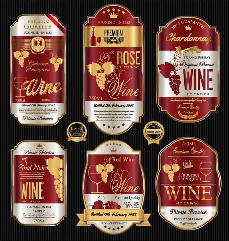
Если вам необходимо сделать премиум этикетки для вина, то данный набор отлично подойдет для различных задач.
Tap to react