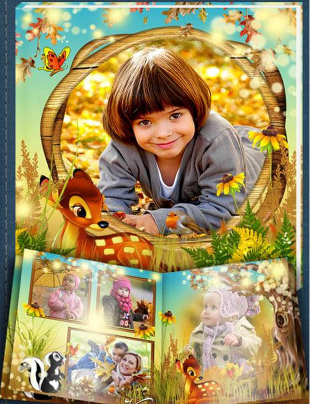
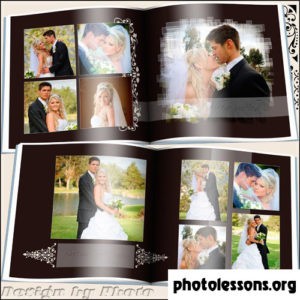
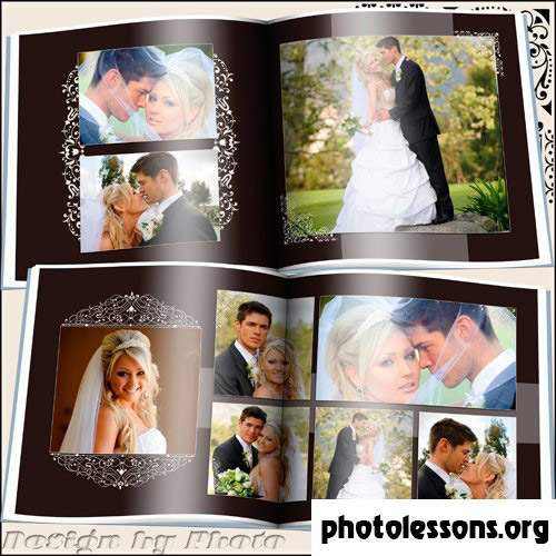
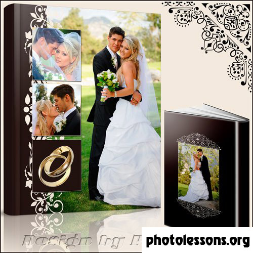
Overview: Why Chocolate Tones Work for Wedding Albums
Most wedding photobook templates default to white, cream, or blush. The chocolate-tone template takes a different path — and it works remarkably well. Warm browns, deep mocha accents, and caramel highlights create an atmosphere that feels both luxurious and grounded. This palette photographs beautifully under the kind of warm tungsten lighting that fills most wedding venues.
The template delivers six PSD files with full layer control. At 157 MB — noticeably lighter than the 502 MB "Two Fates and Two Rings" companion template — it loads faster and responds snappier during editing sessions while still providing 300 dpi resolution on a 7205 by 3602 pixel canvas.
Technical Specifications
| Parameter | Value |
|---|---|
| File format | PSD (Adobe Photoshop) |
| Number of files | 6 layered source files |
| Resolution | 300 dpi |
| Spread dimensions | 7205 × 3602 px |
| Archive size | 157 MB |
| Color mode | RGB, 8-bit |
| Color palette | Chocolate brown, mocha, caramel, cream, gold accents |
| Design style | Warm, elegant, classic with modern typography |
The Chocolate Color Scheme: Benefits and Psychology
Color psychology in wedding album design is not fluff — it directly impacts how couples feel when they flip through the pages years later. Chocolate tones tap into associations with warmth, stability, and comfort. Unlike stark white spreads that can feel clinical, or pure black designs that skew dramatic, brown-based palettes sit in a sweet spot: sophisticated without being cold, warm without being overly sentimental.
Brown tones also have a practical advantage in print. While pure white backgrounds require flawless paper stock (every speck of dust shows), chocolate backgrounds hide minor imperfections and age gracefully. A ten-year-old white album looks yellowed. A ten-year-old brown album looks exactly like it did on day one.
The chocolate palette pairs exceptionally well with certain wedding photography styles. If the couple hired a photographer who shoots with warm natural light, golden hour backlighting, or rich film-era color grades — this template amplifies those qualities rather than fighting them. Conversely, if the wedding photography leans cool and desaturated, the chocolate warmth provides a needed visual counterbalance.
Complementary Accent Colors
The template ships with a default palette, but you can push it in different directions depending on the wedding's actual color theme:
- Gold foil accents — the default. Pairs naturally with chocolate and adds a metallic pop that catches light during page turns.
- Dusty rose — softens the chocolate for a more romantic, garden-party feel. Excellent for spring and summer weddings.
- Sage green — botanical freshness against warm brown. Works beautifully for outdoor and barn weddings.
- Navy blue — a bold contrast. Formal evening wedding energy. The brown-to-navy transition creates depth on double spreads.
- Burgundy — deep red wine tones merge with chocolate for an autumn or winter wedding aesthetic that feels deliberately curated.
Layout Variations and Spread Organization
The six PSD files follow a narrative progression that mirrors the wedding day timeline. Understanding this flow helps you place photos strategically:
Cover and Title Page
File one establishes the album identity. A large hero image dominates, framed by chocolate-toned decorative borders with gold trim. The couple's names and wedding date appear in elegant serif typography. This spread sets the color expectations for the entire album — do not deviate from the chocolate palette here without a very good reason.
Getting Ready / Details
Spread two and three accommodate detail shots: rings, shoes, bouquet, dress details. The layout uses a grid of three to four smaller placeholders per side, surrounded by ample chocolate-toned negative space that lets each detail breathe. Photographers often rush through detail shots, but in an album context these close-ups provide the texture that makes the whole collection feel complete.
Ceremony and Portraits
The middle spreads are designed for the emotional peaks. One full-bleed option and one multi-photo grid option give flexibility. If the ceremony happened in a beautiful church or outdoor setting, use the full-bleed for the wide establishing shot. If the highlights are intimate moments — the vows, the ring exchange, the first kiss — the grid layout sequences them like a storyboard.
Reception and Closing
The final spread transitions to a lighter touch — more cream background showing through, fewer chocolate overlays — to give visual closure to the narrative arc. This is where candid dance floor shots and the cake cutting go.
Comparison: Chocolate Tones vs. Template #1 (Two Fates and Two Rings)
Both templates share the same resolution and file count, but they serve different aesthetic goals:
| Aspect | Chocolate Tones (Template #2) | Two Fates and Two Rings (Template #1) |
|---|---|---|
| Color direction | Warm brown, mocha, caramel | Gold, ivory, charcoal |
| Mood | Intimate, cozy, romantic | Classic, formal, timeless |
| Best for | Autumn/winter weddings, warm-lit venues | Spring/summer weddings, bright venues |
| Archive size | 157 MB | 502 MB |
| Decorative density | Moderate — focus on color blocking | Rich — gold rings, ribbons, ornate details |
| Font pairing | Serif title + modern sans-serif body | Serif title + clean sans-serif body |
| Photo style match | Warm edits, golden hour, film presets | Clean edits, natural light, true-to-color |
| Paper recommendation | Pearl or silk (enhances warmth) | Lustre (preserves detail) |
The choice between these two templates comes down to wedding style and editing approach. If you deliver warm, golden, film-inspired edits — pick chocolate tones. If you deliver clean, neutral, true-to-color edits — pick the classic gold-and-ivory option.
Customizing the Chocolate Template
Customization follows the same smart-object workflow as all our PSD templates. Double-click a photo placeholder, paste your image, save. But the chocolate template has a few specific customization points worth highlighting.
Adjusting the chocolate intensity. The brown tones are driven by a global Color Lookup adjustment layer. Find it at the top of the layers stack, inside the "Color Grading" folder. Toggle it off for a cream-only version. Reduce its opacity to 50-70% for a lighter chocolate wash. Or swap the LUT for a different warm-toned preset — the folder includes two alternatives: "Espresso" (darker) and "Latte" (lighter).
Gold element brightness. The gold decorative accents have their own Hue/Saturation layer. If you are printing on pearl paper — which already has a subtle shimmer — you may want to reduce gold saturation by 10-15% to avoid an over-the-top metallic clash.
Font Pairing Suggestions
The template comes configured with a serif display font for titles and a clean geometric sans-serif for body text. But typography is deeply personal, and a font swap can completely change the album's personality. Here are tested pairings that maintain the warm, elegant mood:
- Playfair Display + Montserrat (both free, Google Fonts). Playfair's high-contrast strokes add drama to titles. Montserrat's geometric neutrality anchors the page. The default recommendation.
- Cormorant Garamond + Raleway (both free). Cormorant is a Garamond revival with a modern edge — more delicate than Playfair. Raleway has a lighter, airier feel that lets the chocolate background breathe.
- Libre Baskerville + Source Sans Pro (both free). A traditionalist pair. Baskerville has been used in wedding invitations for centuries. Source Sans Pro is Adobe's open-source workhorse — never distracting, always readable.
- Noto Serif Display + Noto Sans (both free). The Noto family supports every script you might need. If the wedding involves bilingual text (Russian/English names, Arabic dates), Noto handles it without font substitution headaches.
Whatever pair you choose, maintain high contrast between title and body weight. A bold serif paired with a light sans-serif creates clear visual hierarchy. Mixing two medium-weight serifs from different families creates the typographic equivalent of two people talking over each other.
Photo Selection for Chocolate-Toned Albums
Not every photograph benefits from a warm brown backdrop. Here is a quick reference for what works and what falls flat:
- Excellent: Golden hour portraits, candlelit ceremony shots, sunset couple photos, warm interior venue details, fall foliage outdoor scenes.
- Good: Neutral-toned indoor shots, black-and-white conversions (the chocolate creates a vintage feel), detail close-ups, reception dance floor candids.
- Risky: Heavy blue/cyan color casts (beach weddings with deep blue skies — the warm background fights the cool photo), fluorescent-lit getting-ready shots, snowy winter exteriors.
If you have a mixed bag of warm and cool photos, group them deliberately. Place warm photos on chocolate-heavy spreads and cool photos on spreads where the cream background dominates. The template's adjustable color intensity gives you this flexibility.
Printing and Paper Recommendations
Chocolate tones print differently than lighter palettes. Dark backgrounds consume more ink and can exhibit bronzing on certain paper stocks — a metallic sheen that appears where heavy ink coverage meets glossy coating. Here is how different paper types handle chocolate prints:
- Pearl — top recommendation. The pearl shimmer enhances chocolate warmth without introducing bronzing artifacts. The slight texture adds depth to solid brown areas.
- Silk — close second. The tactile paper surface absorbs ink evenly across dark areas. Expect slightly muted contrast compared to pearl — a tradeoff many prefer for the physical feel.
- Lustre — safe but uninspired. Works fine technically. The semi-gloss surface handles dark tones well. Chocolate just looks less special on standard lustre than it does on textured stocks.
- Glossy — caution. High-gloss dark brown areas act like mirrors. Under angled light, the reflection obscures the image. Only choose glossy if the album will be viewed flat on a table, never handheld.
- Matte — acceptable. Dark tones on matte paper lose punch significantly. Chocolate browns can turn muddy if the printer's black generation settings are aggressive.
\u{201c}We print hundreds of wedding albums monthly. Chocolate-tone designs consistently look best on pearl paper. The shimmer in the paper stock interacts with the warm brown ink in a way that makes the whole album feel like a premium object — not just a photo collection.
Tips for Professional Chocolate-Tone Albums
- Calibrate your monitor before editing. Chocolate tones live in a narrow color range. An uncalibrated monitor that runs cool will make the browns look muddy, prompting you to oversaturate — and the prints will come back looking like a sepia filter exploded.
- Check skin tones against the chocolate background. Caucasian skin tones share red/orange components with brown backgrounds. If skin starts blending into the background, lift the cream element opacity slightly to create separation.
- Export a test print of one spread. Before committing to a full 20-page album, send a single spread to your lab on the intended paper stock. The chocolate tone that looks elegant on screen might print a shade darker — adjusting one spread is easier than reprinting an entire album.
- Black-and-white photos benefit from the chocolate ground. A monochrome portrait on a chocolate spread creates a timeless, almost heritage-album feel. Try converting one key couple portrait to BW and placing it on a chocolate-heavy spread.
- Keep decorative gold elements subtle in print. Gold decorative accents that look appropriately restrained on screen can print distractingly bright on pearl paper. Drop gold layer opacity to 80% before the final export.
Frequently Asked Questions
What makes chocolate tones different from sepia?
Chocolate tones are deep, saturated browns with warm undertones. Sepia is a desaturated reddish-brown associated with antique photography. The chocolate palette uses rich browns as a design element — backgrounds, borders, accent panels — not as a filter applied to the photos themselves. Your wedding images remain in full color on a brown-toned layout.
Will these PSD files slow down my computer?
At 157 MB total across six files, the chocolate template loads noticeably faster than heavier PSD alternatives. Each individual file runs 25-35 MB. Any computer with 8 GB RAM and an SSD should handle editing without lag. If you experience slowdown, flatten decorative element groups that you do not plan to modify — but keep a backup of the original layered file.
Can I use this template for non-wedding events?
Yes. The chocolate palette works well for engagement shoots, anniversary albums, family portraits, and milestone birthday books. The absence of overtly wedding-specific graphics (no ring icons, no bouquet motifs) makes it versatile. Simply replace the wedding date text layer with the relevant event information.
How do I match the font if I do not own the original typeface?
When you open the PSD, Photoshop prompts you to resolve missing fonts. The download includes a readme file with the exact font names and free alternatives on Google Fonts. Install the suggested free fonts before opening the PSD files to avoid the font substitution dialog entirely.
Does the chocolate background use too much printer ink?
Dark backgrounds do consume more ink than white or cream alternatives. However, the chocolate spreads in this template use gradient and textured browns rather than solid blocks — total ink coverage averages 60-80%, well within typical printer limits. If printing cost is a concern, reduce the chocolate layer opacity to 50% for a lighter, more economical print.
Can I mix photos edited in different styles across the same album?
Technically yes, but visually risky. A spread mixing warm golden-hour portraits with cool flash-lit reception shots creates an inconsistent page. The chocolate background amplifies warm tones and can make cool-toned photos look disconnected. Batch-edit photos for consistent white balance before placement, or group warm photos and cool photos on separate spreads.
What export settings give the best chocolate reproduction in print?
Export at 300 dpi as PDF/X-1a with the sRGB profile embedded. If your lab provides a custom ICC profile, use that instead. Under Color Conversion, select "Convert to Destination" and choose your lab's profile. Never select "No Conversion" for professional printing — the result on press will be unpredictable.
Is the 157 MB archive the download size or the extracted size?
The 157 MB figure refers to the compressed ZIP archive. Extracted, the six PSD files total approximately 220-240 MB depending on your file system. The archive is optimized with maximum ZIP compression for faster downloads.
How does this compare to chocolate-tone templates on Envato or Creative Market?
Marketplace templates often prioritize visual impact in preview thumbnails over practical editability. Our chocolate template includes fully named layers, adjustment control groups, and smart-object photo placeholders — features frequently absent from marketplace PSDs that rely on flattened decorative elements. The 300 dpi spec is also genuine; many marketplace listings claim 300 dpi but deliver 72 dpi backgrounds upscaled.
Tap to react


