Данный вариант оформления свадебной фотокниги подойдет многим парам, ведь в ней включены все необходимые элементы:
6 файлов в формате PSD, послойная структура - специально для изменения в программе Adobe Photoshop | Разрешение - 300 dpi | 7205 x 3602 | Размер в архиве - 502 мб
Вы можете прочитать дополнительно на нашем сайте как создать фотокнигу бесплатно в самой популярной программе редактирования изображений - Фотошоп.
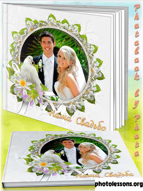
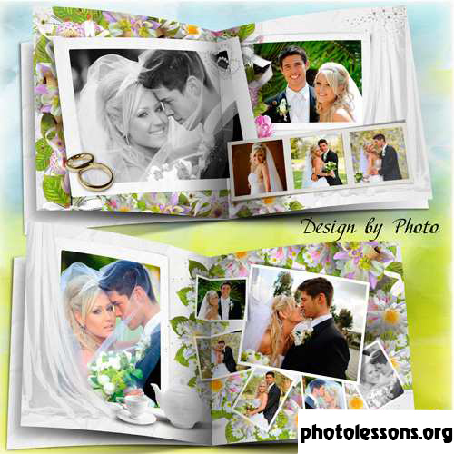
Великолепный фотоальбом для вашей свадьбы!
Tap to react