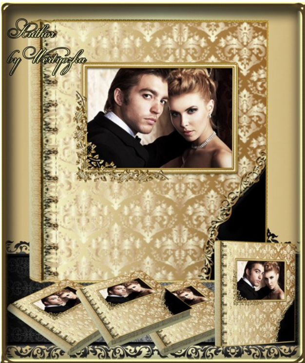
Classic Universal Photo Book PSD — Golden Patterns for Photoshop
Gold in design always signals status. Whether you're making a wedding album, portfolio, or corporate brochure, golden elements instantly elevate the perceived value to "premium." Today we're breaking down a classic photo book with golden patterns — 9 ready-to-use PSD files, 300 dpi, 9374x5575 pixel resolution. This is a serious tool for designers who want to create expensive-looking albums without drawing ornaments from scratch.
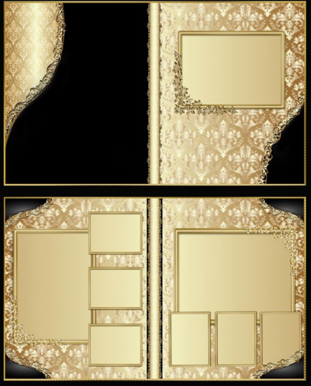
1.31 gigabytes — that's not a typo. Nine files with fully layered structure. Each spread is hand-drawn with a level of detail that no automatic pattern generator can match. Gold filigree, botanical ornaments, geometric frames with smooth curves — all in high resolution, print-ready for formats up to A2. For a professional designer, this saves dozens of hours of work on every project.
What's Inside the Archive
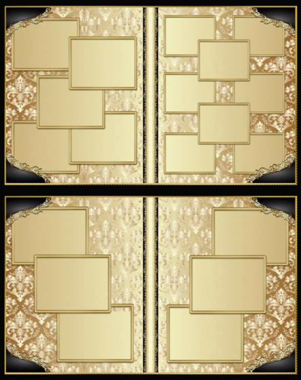
The archive contains 9 PSD files, each a separate photo book spread. Plus 9 JPEG previews for quick viewing without opening Photoshop. Total size: 1.31 GB unpacked. Compressed archive: approximately 800 MB. Each spread has a unique composition but is unified by a consistent style, letting you assemble a cohesive photo book without visual breaks between pages.
| Component | Format | Quantity | Description |
|---|---|---|---|
| Photo book spreads | PSD | 9 | Layered files with golden patterns |
| Previews | JPEG | 9 | Quick viewing without Photoshop |
| Golden ornaments | Built-in layers | 50 plus | Filigree, frames, botanical motifs |
| Background textures | Raster layers | In each PSD | Dark and light variants |
| Photo masks | Smart objects | In each PSD | For inserting your own images |
The 9374x5575 pixel resolution at 300 dpi means you can print spreads up to 79x47 cm without quality loss. For standard 30x30 cm photo books — triple quality margin. For large 40x40 cm albums — also excellent. Even when cropping and scaling individual elements, quality remains top-tier.
Design Features
The golden patterns follow a classic style: baroque filigree, botanical vines, geometric frames with rounded corners. The color scheme is dark backgrounds — black, dark brown, burgundy — with golden accents. The contrast amplifies perception: gold literally glows against a dark background, creating the effect of hot foil stamping even on standard digital prints.
Each spread has a unique composition but all share a unified style. This means the photo book will look cohesive, not like a random collection of pages. Important for client work: the customer sees that the designer thought through the structure, rather than throwing together free internet clip art. Trust me, clients notice this and are willing to pay twice as much for such work.
PSD File Structure
Each file is organized into logical layer groups for maximum navigation speed. The Background group contains a textured background layer — dark paper, leather, or velvet depending on the spread. The Golden Ornaments group includes all gold patterns split into subgroups: frames, corner elements, central ornament. This lets you toggle individual elements without affecting others.
The Photo Masks group contains smart objects for inserting photographs. Just double-click the layer icon, paste your photo, save — and the image automatically fits into the mask with correct scaling. The Text Areas group includes text blocks with pre-selected fonts and sizes — you just replace the placeholder text with your own. The Adjustments group contains adjustment layers for precise gold color tuning to match specific printing conditions.
How to Create a Gold Effect in Photoshop
If you want to not just use ready-made gold patterns but understand how they're made — here's the technique for creating a gold effect from scratch. Take an ornament layer in black and white or gray. Apply a layer style through Layer Style, Gradient Overlay. Set a gradient with multiple stops: dark brown hex 3d2b1f, gold hex c3924b, light gold hex e8c560, white for highlights, gold again. Blending mode Normal, angle 120 degrees.
Then add Bevel and Emboss: style Inner Bevel, technique Chisel Hard, depth about 200-300 percent, size 3 to 5 pixels. This gives the characteristic metallic volume. Without this step, gold looks like yellow plastic rather than a noble metal. The finishing touch is Satin in Multiply mode with dark brown. It adds inner shadows and makes the surface more realistic. Plus a black Drop Shadow with low opacity to visually separate gold elements from the background.
Gold Effect Techniques Comparison
| Technique | Realism | Difficulty | Best For |
|---|---|---|---|
| Gradient plus Bevel and Emboss | Medium | Low | Web graphics, social media |
| Multi-stop gradient plus Satin plus texture | High | Medium | Print work, photo books |
| 3D gold render plus post-processing | Maximum | High | Premium packaging, jewelry |
| Ready-made layer styles (ASL format) | Varies | Minimal | Quick projects |
| Real gold foil texture photograph | Photorealistic | Low | Client approval mockups |
Our template uses a combination of the second and fifth approaches: multi-stop gradients for ornaments and gold foil textures for large surfaces. This balances realism with the ability to edit every element individually.
\u{201c}Gold on screen and gold on paper are two different worlds. What you see in RGB will never match foil stamping or metallic ink. Always coordinate finishing with the print shop before layout begins. Some PSD effects are physically impossible to reproduce in print, no matter how beautiful they look on your monitor.
Where to Use This Gold Pattern Photo Book
Wedding Albums
Gold patterns and weddings are a classic combination proven over decades. Dark backgrounds with gold create an atmosphere of luxury and solemnity that no other color accent can match. Perfect for classic, vintage, and luxury weddings. Less suitable for rustic or boho weddings — those call for kraft paper and pastels. But for ninety percent of orders, the gold photo book will be the most requested option.
Corporate Publications and Portfolios
Annual reports, VIP client brochures, luxury real estate catalogs. Gold on a dark background broadcasts one message: "we're a serious company operating in the premium segment." It works flawlessly on any audience. Simple psychology: if a company can afford gold-accented printed materials, it has resources and confidence in its market position. For photographer portfolios — when you present your work in gold packaging, the client subconsciously assigns higher value to the images. Expensive packaging equals expensive content.
Printing with Gold Elements: What You Need to Know
Standard digital printing doesn't reproduce metallic shine. Gold will look like brownish-yellow, which may disappoint the client. If you need real metallic effect, discuss these options with the print shop: foil stamping — the most expensive and most impressive, gold foil pressed with a heated die; metallic Pantone ink — cheaper than foil but gives real shine, requires a separate press run; UV varnish with gold pigment — a compromise with selective coating; digital printing on metallic paper — cheap but the effect is weaker. For home printing on a photo printer, use only premium glossy photo paper — on matte, gold loses all its charm.
Soft LightA blending mode where pixels lighter than 50 percent gray lighten the image, darker than 50 percent darken it. Perfect for adding highlights to gold. is your best friend when enhancing gold textures. Create a new layer, fill with 50 percent gray, Soft Light mode, and add highlights to raised areas of the ornament with a soft white brush. Gold immediately gains dimension and realism.
Preparing Files for Print and Alternative Styles
When the design is ready, the most important part begins — print preparation. The print shop won't figure things out for you. First: convert RGB to CMYK via Edit, Convert to Profile with FOGRA39 for Europe or US Web Coated SWOP v2. Check bleeds: if your spread is 30 by 30 cm and the background extends to the edge, add 3-5 mm bleed on all sides. Without bleeds, white strips remain after trimming.
Verify resolution is exactly 300 dpi — check it wasn't lost when scaling smart objects. Rasterize fonts or convert to shapes via Layer, Type, Convert to Shape. Final step: save as PDF/X-4 via File, Save As, Photoshop PDF. Check Preserve Photoshop Editing Capabilities and Embed Page Thumbnails.
By changing this same template's color scheme, you get alternative styles: silver wedding (cool dark blue background, silver instead of gold — strict elegant design for black and white photos), rose gold (dark beige background, Hue shifted red — recent trend for women's portfolios), bronze and copper (warm tones for vintage with sepia photos), chrome and platinum (minimalist high-tech for corporate). When working with clients, always show three options for the classic decoy pricing effect.
Gold Design Trends in Photography 2024-2026
Gold in design is experiencing another renaissance. After the 2010s minimalism with flat colors and no textures, designers are returning to tactile, textured solutions. Gold foil, embossing, metallic elements — a top print trend for the last two years. Major wedding publications like Brides and Wedding Magazine feature spreads exclusively with gold accents. Luxury brands from jewelry houses to automotive companies use gold in printed catalogs as a premium marker.
In 2025, a trend emerged combining gold with deep emerald, sapphire, and green tones — a classic luxury combination. Parallel to this is the "dark luxury" direction: black backgrounds, gold accents, minimal text. The third vector pairs gold with pastels: powder pink for women's portfolios, lavender for beauty work.
The Golden Ratio and Luxury Design Principles
Beautiful ornaments are half the work. The other half is placement according to the golden ratio (approximately 1:1.618). The human eye subconsciously finds objects placed by this rule more harmonious. Key photos on a spread shouldn't be centered — offset them approximately 38 percent from the left or right edge. Our template spreads already follow the golden ratio: photo masks are placed in phi-adjacent proportions, not on a simple grid.
Luxury design follows four key principles: no more than 30 percent of the page surface should be decorative elements with 70 percent being air and photography. Empty space around a gold ornament works harder than the ornament itself. One accent per spread — if you have a large central filigree, don't add corner frames. And finally, a shine hierarchy: the brightest highlight on the main accent, secondary elements in matte gold or muted tones. Our template achieves this through different Bevel and Emboss depth levels across layer groups.
Gold Foil Effect Tutorial for Photoshop
Real gold foil is the most sought-after luxury design effect. Place a high-resolution gold foil photo above the ornament and apply a Clipping Mask (Ctrl+Alt+G) to constrain the texture to the ornament shape. Set blending mode to Overlay or Soft Light to preserve ornament volume, or Screen for maximum shine. For a second method without stock photos: create a gold gradient layer, go to Filter > Filter Gallery > Texture > Grain with Clumped grain type, then Filter > Blur > Surface Blur at radius 5-7. Add Bevel and Emboss for volume. A third advanced method combines Displacement Map and Lighting Effects for photorealistic foil that reacts to imaginary light sources.
Font Pairings for Luxury Designs
Gold ornaments demand matching typography. For luxury headlines, use classic serif fonts: Garamond, Playfair Display, Bodoni, Didot. These convey tradition, stability, and history — exactly what wedding albums and anniversary editions need. For modern interpretations, use thin sans-serif like Montserrat or Raleway Light. A bulletproof pairing: Playfair Display for headlines plus Source Sans Pro for body text. For names and dates, use calligraphic fonts like Great Vibes or Alex Brush — they complement the gold aesthetic and work beautifully with metallic layer styles. Avoid slab serifs and monospace fonts which clash with flowing golden ornament lines. For a 30x30 cm photo book: headlines at 24-36 pt, names at 14-18 pt, body text at 10-12 pt, with generous tracking for all-caps titles.
Frequently Asked Questions
Which Photoshop version opens these PSD files?
Files are compatible with Photoshop CS6 and all CC versions. Maximum compatibility preserved. Smart objects require CS6 or newer.
Can I use the template in commercial projects?
Yes. Create photo books for clients and use in design studios. The only restriction: cannot resell the PSD files themselves as a standalone product.
How do I insert my photos into the template?
Double-click the smart object layer icon, paste your photo, resize with Ctrl+T, save with Ctrl+S. The photo automatically fits the mask.
Why are the files so large (1.31 GB)?
High resolution 9374x5575 px at 300 dpi plus many layers with detailed ornaments and smart objects. The price of large-format print quality.
What paper format is suitable for printing?
Spreads designed for formats up to 79x47 cm. For standard 20-30 cm photo books — triple quality margin.
Gold looks dull after CMYK conversion. What to do?
CMYK can't match RGB gold brightness. Use metallic Pantone ink for real shine, or boost CMYK contrast to an acceptable level.
Can I change the gold patterns to silver?
Yes. Hue/Saturation adjustment layer above ornaments with Clipping Mask (Ctrl+Alt+G). Works for silver, bronze, copper, and rose gold.
How long does it take to lay out the photo book?
With the ready template: 2-3 hours for all 9 spreads. Most time goes to photo selection and cropping.
Is the template suitable for children's photo books?
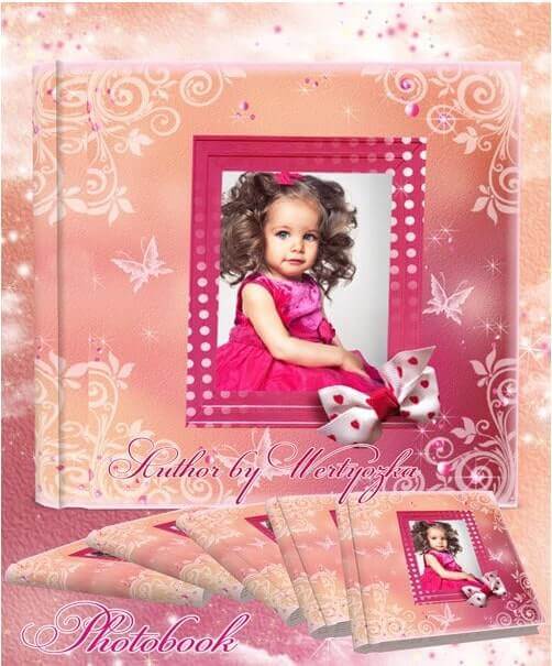
More for adult themes. For children, lighter style is better. Though for prince and princess concepts — gold is appropriate.
What if Photoshop lags while working with these files?
Disable visibility for unused layers. Turn off GPU acceleration on weak cards. Or temporarily reduce resolution for layout work.
Tap to react