Скачать бесплатно по прямой ссылке 50 красивых светлых иконок в стиле иероглифов в разрешении 600 на 300 px размером 251,67 кб.

Tap to react
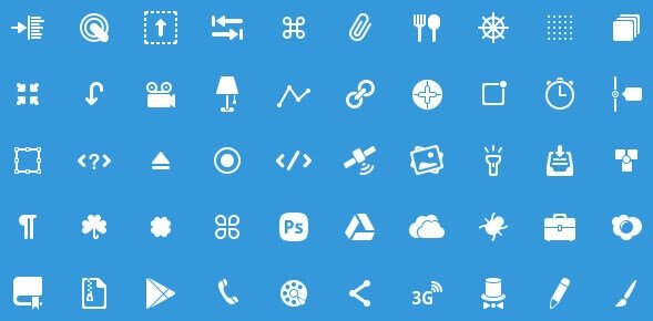
50 Icons Glyphs - иконки для Фотошоп в PSD
Скачать бесплатно по прямой ссылке 50 красивых светлых иконок в стиле иероглифов в разрешении 600 на 300 px размером 251,67 кб.
Tap to react